2005.08.23 13:28
Tiring architects VS Real Architects
The late period of artists is often under-rated. Picasso's Late Period was mostly disliked while he was alive--seen as repetitious and unimportant. Yet, with Picasso dead, the late works are not so unimportant anymore, in fact they manifest one of Picasso's most creative periods.
Frank Gehry may be in a wonderful position if he continues to do architecture for another decade or so, because, when he isn't around anymore, his late works might just manifest his most creative period.
I like to look at and study the late periods of artists because of all the facile-ness and confidence and even (if you're lucky) the "I don't give a damn" found there.
Philip Johnson produced an interesting late period, and he did change 'styles' with every new project, yet his overall style has always been reenactionary architecturism.
2007.10.14 17:52
Negative notes
"In Modern architecture we have operated too long under the restrictions of unbending rectangular forms supposed to have grown out of the technical requirements of the frame and the mass-produced curtain wall. In contrasting Mies' and Johnson's Seagram Building with Kahn's project for an office tower in Philadelphia it can be seen that Mies and Johnson reject all contradictions of diagonal wind-bracing in favor of an expression of a rectilinear frame. Kahn once said that the Seagram Building was like a beautiful lady with hidden corsets. Kahn, in contrast, expresses the wind-bracing--but at an expense of such vertical elements as the elevator and, indeed of the spaces for people."
--Robert Venturi, Complexity and Contradiction in Architecture (New York, MoMA, 1966), p. 56.
"Yet in City Tower, Kahn no more succeeded in making strides in architectural structure than he had in the Art Gallery at Yale. He erroneously discussed the project in tectonics terms, justifying City Tower's form by arguing that it best expressed buttressing against wind stresses: "The mind envisions a construction of a building growing from a base crossing its members as it rises against the forces of the wind." Yet neither Tyng nor Kahn checked their wind-stress argument with a structural engineer, who would have told them that because of the forces of gravity, a tower rising in a more-or-less straight vertical is dramatically more efficient."
--Sarah Williams Goldhagen, Louis Kahn's Situated Modernism (New Haven, Yale University Press, 2001), p. 78.
"Yes, architects sometimes used to make stuff up just to justify (the shape) their designs."
"What do you mean 'used to'?"
| |
2013.01.13 13:58
13 January
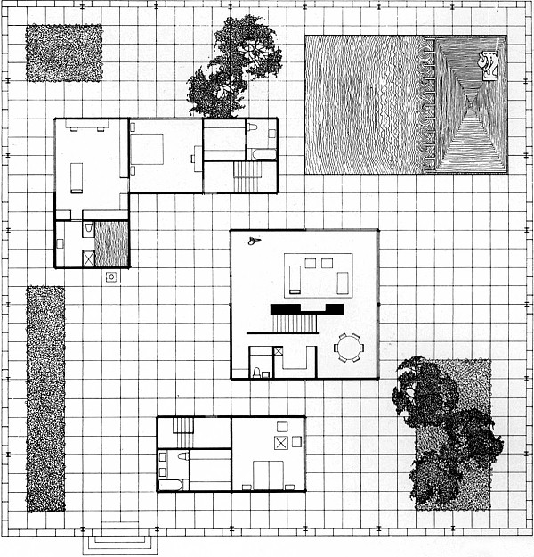
Today, at Archive of Affinities, Philip Johnson's 1956 design of the Burden House is mislabled as the 1954 Davis House.

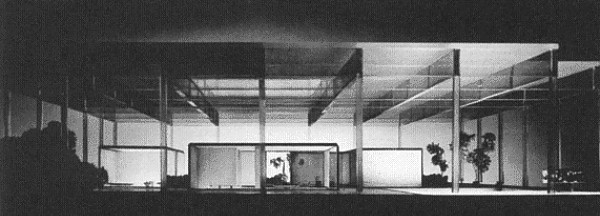
Nevertheless, I was intrigued by the Burden House plan to find its design in three dimensions.

| |
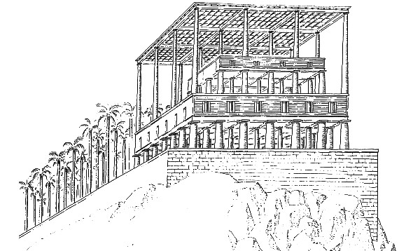
This reinvigorates the analysis of 'houses under a common roof' -- Houses Under a Common Roof, Maison l'Homme, Housing for La Villette, and even brings Leon Krier's 1977-84 Hypostyle House into the study.

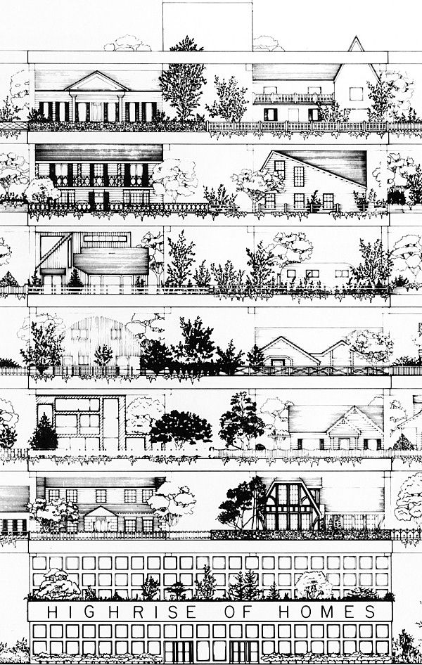
Which strangely leads back to the first image at Archive of Affinities today, Site's 1981 Highrise of Homes:

|