behind the scenes | multiple vision |
|
|
|
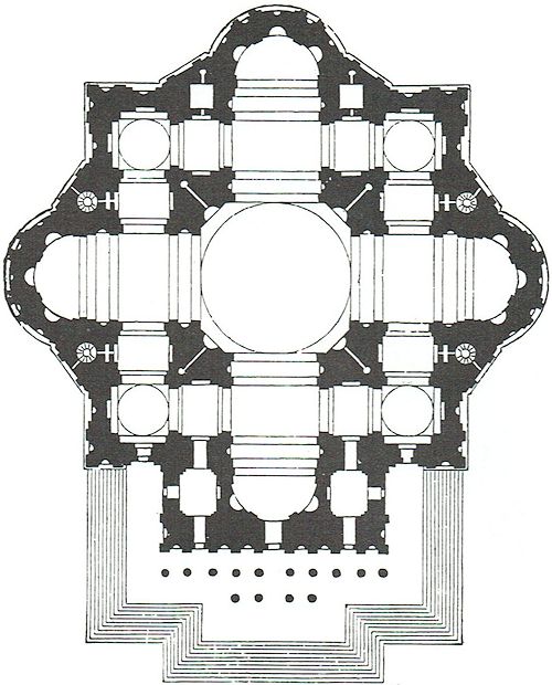
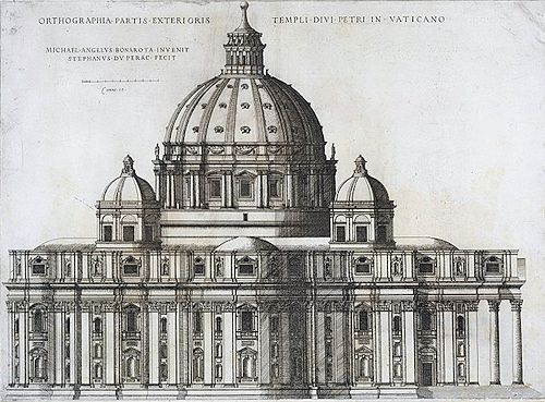
James Ackerman has referred to Michelangelo's predilection for "symmetrical juxtaposition of diagonal accents in plan and elevation" in his design for St. Peter's, which was essentially a renovation of earlier construction. "By using diagonal wall-masses to fuse together the arms of the cross, Michelangelo was able to give St. Peter's a unity that earlier designs lacked."
|
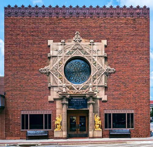
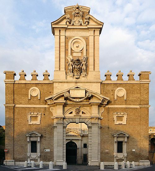
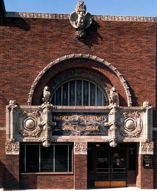
The window above Sullivan's portal in the Merchants' National Bank in Grinnell, Iowa, is almost identical to the Porta Pia in its juxtaposition of an equal number of round, square and diamond-shaped frames of equal size. The diverse combinations of number analyzed in his Columbia Bank facade (groups of elements involving one, two, and three parts) have almost equal value in the composition. However, there the unity is based upon the relation of horizontal layers rather than on superimposition.
|
|
|
|
|
www.quondam.com/32/3207d.htm | Quondam © 2020.05.04 |
