2015.09.07 19:11
Rem Koolhaas, designing through writing?
A few of weeks ago I began compiling a (personal/Quondam) OMA/Koolhaas dossier, and, so far, I wouldn't say Koolhaas "design[s] his architecture through his writings or books." Certain design themes from "Exodus" and Delirious New York do recur throughout the oeuvre, however. More to the point, perhaps, it may well be that the now vast oeuvre itself continually breeds new design ideas.
2015.09.07 19:43
Rem Koolhaas, designing through writing?
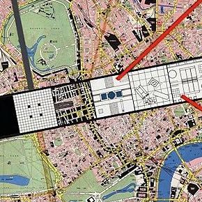
Koolhaas Zenghalis Exodus or the Voluntary Prisoners of Architecture 1971
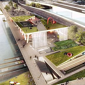
OMA Olin 11th St. Bridge Park Washington DC 2014
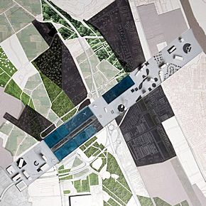
OMA Parc des Expositions (PEX) Toulouse 2014
| |
2015.09.08 10:11
Rem Koolhaas, designing through writing?
Ingrid Böck in Six Canonical Projects by Rem Koolhaas: Essays on the History of Ideas often relates an OMA/Koolhaas design to some Koolhaas text, yet not in the sense that the text then explains the design process. Rather, one begins to see the build-up of a consistency between 'theory' and 'practice' (so to speak). I'm certainly not familiar with all of Koolhaas' writings, but, of those I know, the predominant theme is one of analyzing, explaining, and even elucidating existing built environment conditions. In turn, these ongoing observations of what it's like "out there" start to form an attitude toward how to design within the "present conditions' to the point of actually exploiting the "present conditions."
Without writing about it explicitly, OMA/Koolhaas designs themselves exhibit an attitude where the conditions (of the ongoing history) of Modern Architecture are also exploited.
2015.09.08 14:21
Architecture of Decadence
2004.04.14 22:25
Re: "Revivalists..."
"Ludwig did not set out to copy the entire Palace of Versailles; in fact, he conceived Herrenchiemsee as something of a shell, in which only two rooms were of consequence--the State Bedroom and the Hall of Mirrors. He commissioned architect Georg Dollmann and, later, Julius Hofmann, to faithfully duplicate the center block and side wings, He eventually wished to include to longer auxiliary wings containing the chapel and court theater, but money ran short before these schemes could be executed. The king never intended that all the rooms should be completed: From the beginning, Herrenchiemsee was to be a set piece into which certain rooms were to be introduced. Their bare plaster walls, bricked up windows, and vaulted stone ceilings only served to fill out the space behind the palace's facade, providing an eerie contrast to the extravagant rooms of the piano nobile. By the fall of 1885, the palace was ready for a royal visit."
--Greg King, The Mad King: A Biography of Ludwig II of Bavaria, pp. 241-2
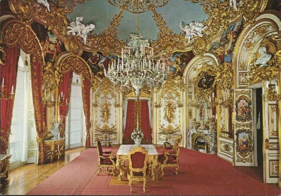
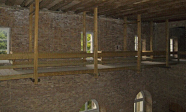
Earlier today, while driving to the local post office (which is within a large local shopping center, which years ago was the site of Heinz Manufacturing), I passed by what until a year or two ago was a K-Mart. For some reason the entrance to this place was wide open, and inside was an enormous, cavernous space. I thought to myself, "Gosh, the interiors of these stores are so ephemeral." Then I thought, might it not be interesting if homes were treated/designed like BIG BOX stores. Now, thinking of Herrenchiemsee, why can't all BIG BOXES look like Versailles on the outside and empty shells on the inside. Or, is that what is kind of already happening, and Ludwig was a "dreamer" just a head of his time.
| |
2005.05.20 10:01
Living Architecture, Programmable and Mutant
Oh goody, more mutant metaphors.
Not only do I want architecture that is alive, but I want it to be sinful as well. It should lie, cheat, steal, even kill when necessary. Oh, and don't forget covet. Architecture should covet, covet, covet. When I steal something, the architecture around me should steal more. When people I don't like enter my architecture, the architecture will attack them, kill them, and then cremate them--the architecture will of course use the energy wisely.
When I am happy, the architecture will quickly show me that happiness is fleeting and stupid. The architecture will show me back to indulgence, greed and even gluttony. Architecture is alive with the sound of the vomitorium!
2005.05.20 11:01
Living Architecture, Programmable and Mutant
2005.05.2013:42
hotrod architecture
Along with performance, the notion of 'extreme', taking something to an extreme, seems to be necessary to the concept of hotrodding as well.
[The] example of the 'sleeper' is especially provocative architecturally in that two extremes are present in the 'design'--the super engine inside and the "rustying, paint peeling off everywhere a thin crack line runs across the windshield etc. etc." facade.
Suddenly I want to design architecture along the lines of looking like a dilapidated shack on the outside yet like the Hall of Mirrors a la Versailles on the inside.
Wait a minute. Ludwig II as hotrod sleeper architecture client! Who knew?
2005.05.20 14:12
hotrod architecture
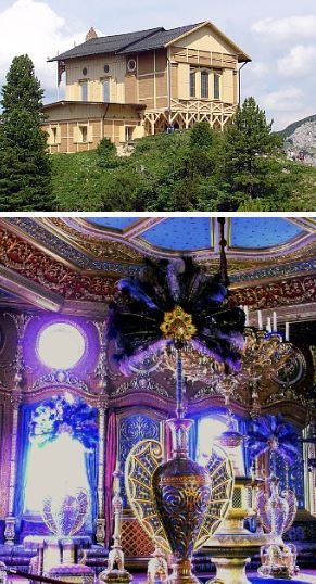
In the case of Schachen, the building was to perform as a retreat, a "mountain refuge." The "Swiss chalet" motif certainly upholds the notion of a place of retreat in the Bavarian Alps. Yet inside there is an overly opulent "Turkish Hall" which offers retreat in a very extreme way, you could say both physically and metaphysically, a retreat virtually into dreamland, like a psychedelic trip even. (And who knows what "drugs" might have been done there.)
Architecture performs on all kinds of levels, from the structural (the most necessary and literal performance), to the mechanical (and here plumbing and electricity seem the most pervasive), to the programmatic, to even the symbolic. Doors have to perform, windows have to perform, toilets have to perform, roofs have to perform, etc., etc..
Perhaps it's as simple as taking any performance aspect of architecture to an extreme and you then have a design methodology analogous to hot rodding.
| |
2005.05.20 16:24
hotrod architecture
Picking up on "stealth communication with other experts," I'm recalling a detail from Kahn's Esherick House. I think in the hall right as you enter the house there is a light switch panel unlike anything I've ever seen before. Not only are there like eight toggle switches in a row, but the panel is set on the wall vertically, as opposed to the traditional horizontal mounting. Granted this is just a small detail, but, given that the building dates from 1959-61, such a light switch panel seems extreme (and I certainly thought that when I first saw it in 1977), but also elegantly simple in its execution.
While I'm "in" the Esherick House, the windows here also have an extreme-ness to them, and these windows are very much integral to the architecture.
And now I'm thinking of the enormous light hoods that "light" the communal spaces of Kahn's Erdman Hall dormitory at Bryn Mawr. Again there is this extreme-ness in terms of how light enters the space, and the resultant effect is very much part of what makes Kahn's architecture "great".
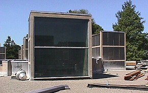
And now thinking further about "windows," my favorite panes of glass remain those at either end of the quondam Liberty Bell Pavilion (vintage 1976). While not a makeover, per se, the detailing of this building has an extreme-ness to it overall, even to the point where the roof/ceiling is split right down the middle so as to not disrupt the axis of Independence Hall. And even aesthetically, if you look at this building closely, it wouldn't be a stretch to say it has a 'hot rod' feel to it. And, as to performance, as much as most didn't like the building, representatives of the National Park Service will nonetheless admit that it served its purpose of allowing thousands and thousands of visitors to see, stand by, and touch the Liberty Bell very well.
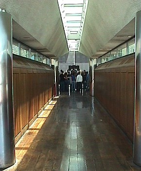
Anyway, I never expected to be thinking about Kahn and Mitchell/Giurgola architecture in conjunction with "hot rodding", so again, "Who knew?"
|