history | not an easy book |
|
|
|
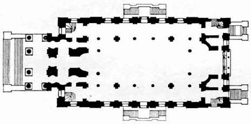
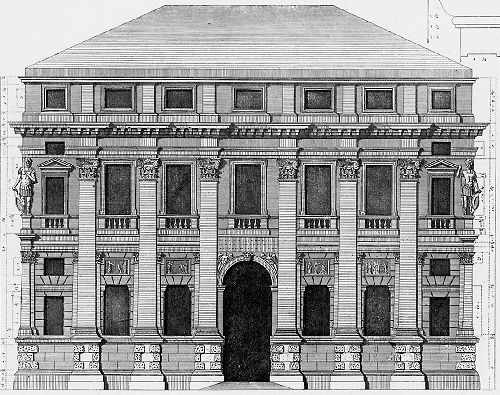
In the plan of Christ Church, Spitalfields, it is the sequence of orders of supports-higher, lower, and middle; large, small, and medium-that make the hierarchical whole. Or in a palace facade of Palladio, it is the juxtapositions and adjacencies of parts (pilasters, windows, and mouldings) and the contrasts of large, small, and relatively important that conduct the eye to the image of the whole.
|
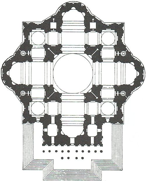
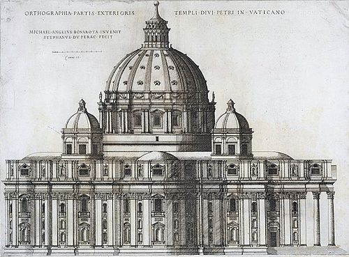
James Ackerman has referred to Michelangelo's predilection for "symmetrical juxtaposition of diagonal accents in plan and elevation" in his design for St. Peter's, which was essentially a renovation of earlier construction. "By using diagonal wall-masses to fuse together the arms of the cross, Michelangelo was able to give St. Peter's a unity that earlier designs lacked."
|
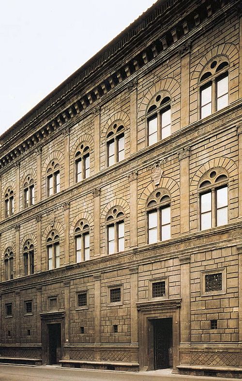
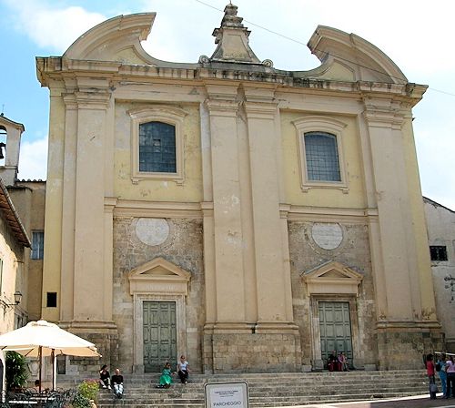
The dominant binder, as a third element connecting a duality, is a less difficult way of resolving a duality than inflection. For example, the big arch unambiguously resolves the duality of the double window of the Florentine Renaissance palazzo. The facade of the double church of S. Antonio and S. Brigidá by Fuga is resolved by inflected broken pediments-c-but also by a third ornamental element, which dominates the middle.
|
www.quondam.com/45/4508j.htm | Quondam © 2020.04.19 |
