Much of Robert Venturi's theory seemed as perverse and Camp in the 1960s as it seemed startling and new. Venturi acclaimed the decorated shed, yet that is what the neohistorical architects of the 1950s were blamed for creating--decorative screens around Bauhaus buildings. Ironically, Nikolaus Pevsner's first sentence in his Outline of European Architecture (1943) is "A bicycle shed is a building; Lincoln Cathedral is a piece of architecture." He continued, "Nearly everything that encloses space on a scale sufficient for a human being to move in is a building; the term architecture applies only to buildings designed with a view to aesthetic appeal." So when, twenty years later, Venturi called Rheims Cathedral "a decorated shed," it was a potently perverse twist. He said it at a time when we used to decry the false front--as in a typical western-frontier nineteenth century--as "facade architecture."
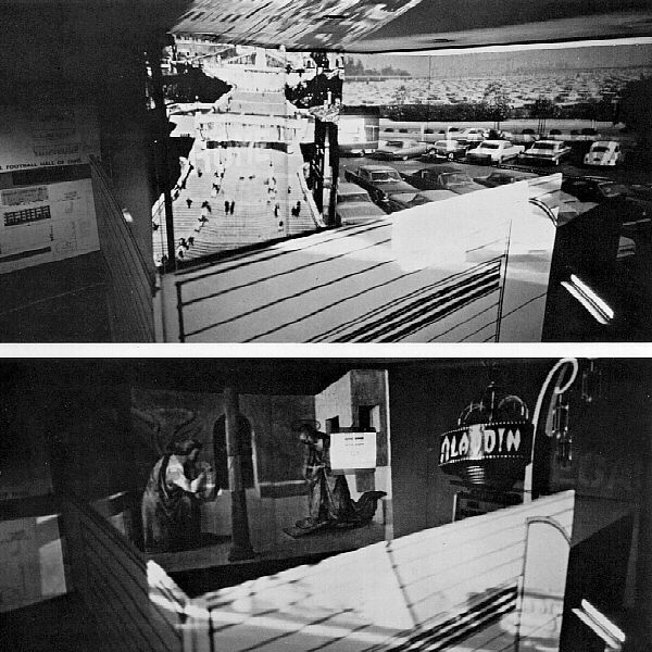
Venturi demonstrates his witty sense of paradox in an exhibition of his firm's work at Philadelphia's Art Alliance in 1968. There, besides wall-mounted drawings and photographs of the firm's work, projected slides were juxtaposed of adjacent walls, and other signs and images were superimposed on the projections. Among contradictory pairs of slides were: a commercial strip of gas stations with a forest of attenuated columns supporting vacuum-formed logo signs and, in contrast, the multicolored court of lions in the Alhambra; Rome's populated Spanish Steps contrasted with a full American parking lot.; Perpendicular Gothic fan vaulting as against the multiple parallel lines of a neon sign; Archaeological ruins next to the parking lots and signs of Las Vegas; the arcade of the Doge's Palace in Venice seen adjacent to the piers of a freeway; and finally, a spaghetti tangle of roadways contrasted with the repetitive arches of the Baptistry at Pisa. These historical-contemporary, European-American juxtapositions--possible only since "the museum without walls" of photography--showed Venturi accepting a wider range of our visual environment as being comparable and evidently occupied by the same animal--man. It was an open-minded, inclusive, realistic view of the actualities of the status quo; it was novel and iconoclastic. But although it had strong meaning, it was essentially a comic approach.
C. Ray Smith, Supermannerism: New Attitudes in Post-Modern Architecture (New York: E. P. Dutton, 1977), pp. 212-13.
| |

From Rome to Las Vegas: An Exhibit of the Work of Venturi and Rauch at the Philadelphia Art Alliance, 1968
| |
2005.10.12 15:09
Jimmy Venturi's new website...
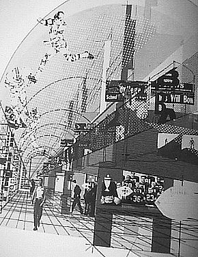
On page 18 in A View from the Campidoglio is the famous collage architectural rendering of the Venturi & Rauch Football Hall of Fame--a "changing times" updated version of the collage renderings of Mies van der Rohe, and today oft reenacted by MVRDV (to name just one current group of architects furthering the tradition). MDRVD's Costa Iberica: Upbeat to the Leisure City is a "changing times" updated version (i.e., reenactment) of Learning from Las Vegas: The Forgotten Symbolism of Architectural Form. At least take the time to compare pages 282-83 of Costa Iberica with the cover of Out of the Ordinary. Maybe it's just coincidence that MVRDV's DataScape exhibition design is extremely similar to From Rome to Las Vegas: An Exhibit of the Work of Venturi and Rauch at the Philadelphia Art Alliance, 1968 (as pictured in Learning from Las Vegas, page 125, 1st edition), and boy do those collage rendering on page 124 look exactly like MVRDV's au courant renderings.

Not to be (dis)missed:
The Campidoglio: A Case Study
A Billdingboard Involving Movies, Relics, and Space
Learning from Lutyens
Learning from the Rear
Pop Off
Some Houses of Ill-Repute
Functionalism, Yes, But...
Complexity and Contradiction in the Work of Frank Furness
Plain and Fancy Architecture
Alvar Aalto
A Definition of Architecture as Shelter with Decoration on It, and Another Plea for Symbolism of the Ordinary in Architecture
Learning the Wrong Lessons from the Beaux-Arts
Learning the Right Lessons from the Beaux-Arts
Il Proprio Vocabolario
The RIBA Annual Discourse
Diversity, Relevance and Representation in Historicism, or Plus ca Chance...plus a Plea for Pattern all over Architecture with a Postscript on my Mother's House
Is calling something "b-side" an example of commercialism creeping into architecture criticism. Hey, as long as it sells, right. Imagine that, the institution of criticism based on commerce and consumerism! Does sinister even know what dexter is doing?
|

