history | Room Containing Greek Vases |
| So, too, in the same sense, was the Yale Department of Architecture to which Kahn returned in 1951. Concentration upon the integrally jointed wooden frame--calling to mind Kahn's later use of pre-cast concrete components--played an increasing part in its doctrine during 1950-55, largely through the influence of Eugene Nile, then critic of first-year design. In this he was supported by George Howe who, in part through the efforts of Kahn, had become Chairman in 1950 and remained such until 1954. His successor, Paul Schweikher, held similar ideas. Along with the frame went an insistence upon its structural definition of single or separate volumes of space rather than upon the earlier, spatially fluid, fundamentally non-structural type of International Style planning. Here, too, Kahn's later work is recalled, but he avoided the several anti-intellectualisms in which Yale's movement temporarily foundered, and must instead have been reminded anew of the traditional method of Choisy. At Yale Kahn was also in close contact with Philip Johnson and with that architect's then very fresh principles of classicizing order. More broadly, the debilitating hostility between architect and historian which had characterized some of the pedagogy of the Modern Movement was on the wane at Yale, despite periodic attempts to revive it, and Kahn was exposed there to free, as against what might be called court (late Beaux-Arts or Bauhaus) Art History in general. He often dropped in on lectures; San Gimignano, Hadrian's Villa, and the work of Brunelleschi were rather obsessive favorites at the time. | We come to our favorite man, Mr. Lou kahn; he is one of the bright stars in our firmament, it seems to me. In the old days, when he started on the museum here (this was done how many years ago? since the war) it is purely International Style, without any articulation. The proportioning of the other street is much more careful and more beautifully done. It has, of course, like all International Style buildings, a certain boredom, which was inflicted on him by the problem. He had to carry the floors from the old building, and I have often had that problem; it's insuperable. He also had the problem that they didn't put in the air-conditioning when they built the building, as they should have done, and that is now going in. The corner problem (which you remember is a problem we discussed) is that you have to watch out for the corners against the ground, the corners against the sides. If you walk around the corner of this building, there is a solid wall, where there are water tables to give you the scale of the floors behind. This water table then appears to be peeking around, like a little dot at the corner. In other words, the composition of one side was very hard to adjust to the composition on the other. No water table was needed or wanted on this facade, so it had to stop like the little dribble on the corner. |
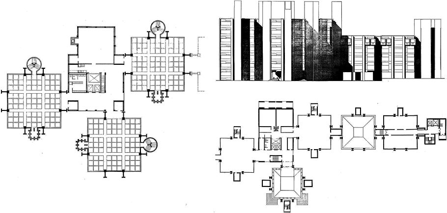
Alfred Newton Richards Medical Research Building early scheme plan
Alfred Newton Richards Medical Research Building and Biology Building final scheme elevation plan
|
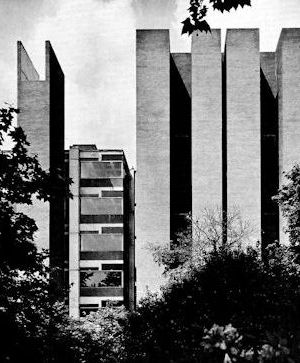
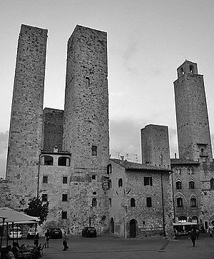
Lou Kahn, however, got hold of himself after this building and did what he had always wanted to do, and this is really one of the most exciting buildings that we have; it is the Richards Medical Research Building down in Philadelphia at the University of Pennsylvania, where he is now, at it shows him at his neo-functional best; that is, he feels he should pull the building apart and make every part express itself. These are the three laboratory towers, and the center is whatever is left over. These are ventilators (you will see them later in the model), and the stairs. He had to make these square, because of the law in Philadelphia, but he wanted them round, as you can see. Every part expresses something different--out, away, even to the return here, to express that this is not this and is not doing the same thing as that. Lou even goes so far as this: When he had some air-conditioning ducts that he wanted to get from on one side of the building to another, and the engineer said, "Well, we will run it diagonally across that way," Lou said, "No, if a man has to walk that way to get there, then the under-floor ducts should go that way, even though you never see them." That is the kind of aesthetic logic which is expensive, but rather wonderful, because it shows his absolute will, which is revealed in his exterior architecture by the articulation of every single part. Here are eight columns that make a two-way gridiron ceiling out of every room, forty-five feet across; the independent rooms each express themselves, but look what happens on the outside. This is an early drawing in which those towers that stuck out are expressive. They are expressing something very different from what we used to think of as architecture. See this tower, for instance: it is one of the ventilator towers, and of course it gets wider as you have more and more laboratories venting into it. The result is enormous congeries of San Gimignanesque towers with dark, very dark, corners between those great blocks where they went together, and very jagged sky projections. If you take the usual things we look at in a building, you'll see that the silhouette against the sky is unique in his work, and unique in odern architecture, and is most expressive. Where are the corners? All of these are corners--the whole thing. This corner is held by the things that project on either side--there are myriad corners. I'm sorry to say I haven't yet seen how the base is handled, but when the building is up, I imagine you will get a shock about a new way to relate the building to the ground. Kahn is one of the few really original revolutionaries against the classic type of modern architecture.
Philadelphia
San Gimignano
|
www.quondam.com/45/4501x.htm | Quondam © 2018.07.31 |


