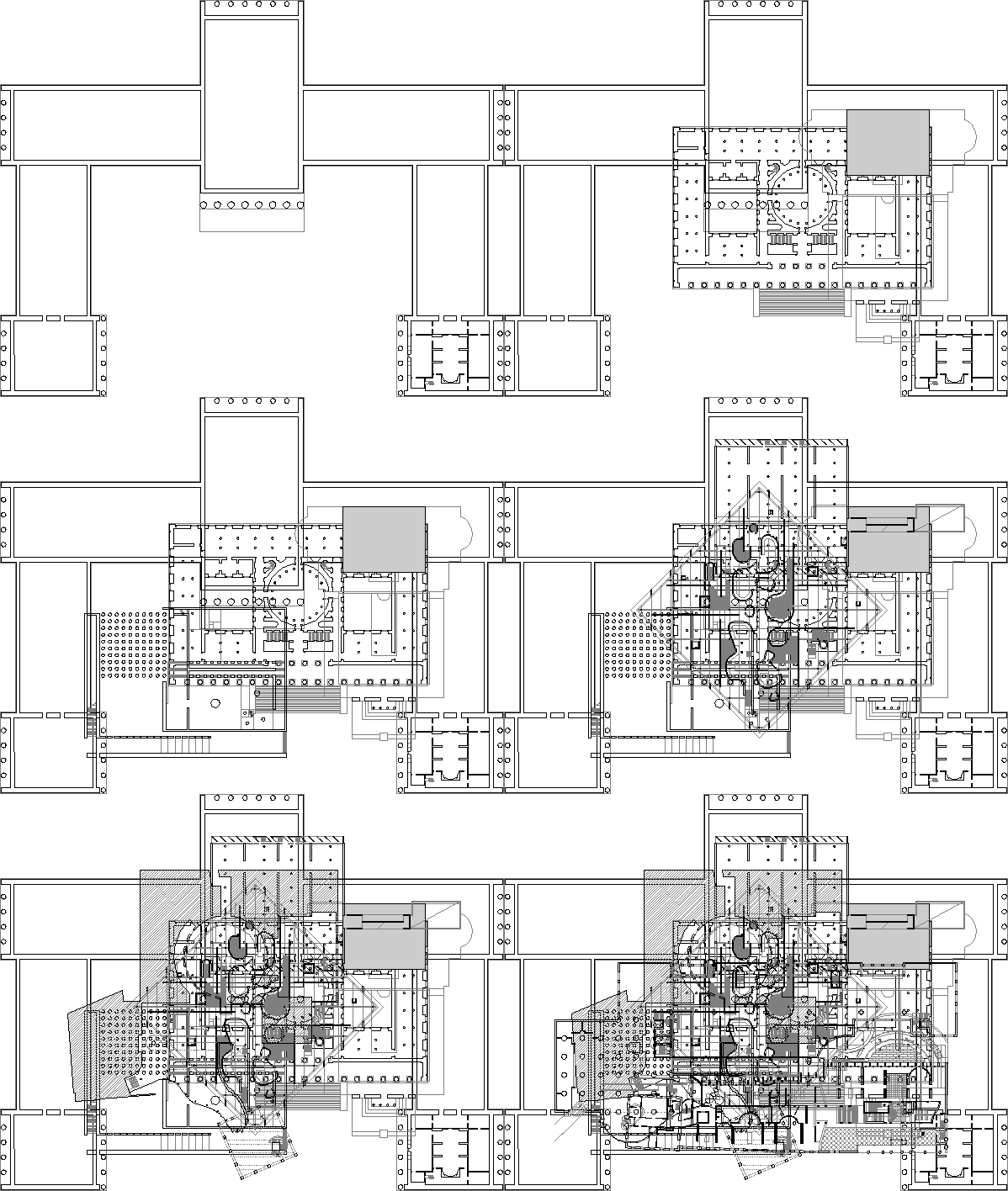
2007.03.09 18:28
...and speaking of random tangents
I had no idea Herzog & de Meuron were working on a design for the Parrish Art Museum. ...the plan also reminds me of random tangents.
2007.03.09 22:02
...and speaking of random tangents
The four architects had decided to achieve an effect of harmony and therefore not to use any historical style in its pure form. Peter Keating designed the white marble semi-Doric portico that rose over the main entrance, and the Venetian balconies for which new doors were cut. John Erik Snyte designed the small semi-Gothic spite surmounted by a cross, and the bandcourses of stylized acanthus leaves which were cut into the limestone of the walls. Gordon L. Prescott designed the semi-renaissance cornice, and the glass-enclosed terrace projecting from the third floor. Gus Webb designed a cubistic ornament to frame the original windows, and the modern neon sign up on the roof, which read: "The Hopton Stoddard Home for Subnormal Children."
"Comes the revolution," said Gus Webb, looking at the completed structure, "and every kid in the country will have a home like that!"
The original shape of the building remained discernable. It was not like a corpse whose fragments had been mercifully scattered; it was like a corpse hacked to pieces and reassembled.
--Ayn Rand, The Fountainhead (1943), pp. 385-6.
Is anyone reading Frascari's Monsters of Architecture these days?
Are monsters merely crazy, mixed-up reenactments?
| |
2007.07.08 12:52
8 July
Maybe the twin couples are going to publish a new journal on architecture entitled Appositions.

Were ideology and style once Siamese twins?
2007.07.13
next cad work at Quondam
With regard to Appositions, start creating a whole bunch of plan appositions, really just do them...
...also create interesting drawing compositions in the process. And I want the notion of scale comparisons to be evident as well. This might turn out interesting, especially with inclusion of the mesh and surface models (in plan).
And generate a whole bunch of new plans via creating perspectives of the plans. Since none of this work actually means anything, I could also be as experimental, playful and even sarcastic as possible...
| |
2007.07.17
Le Corbusier plans, etc.
In starting to do some cad apposition play tonight I found myself stifled by not knowing how to start. It seemed that the "right" plans were not at hand, and/or the scale of plans did not mix. In thinking about it now I should have just started with whatever was available and continued generating apposed plans one after another. As a result of not knowing what to do, I started to compile plans of Le Corbusier designs in the collection. I suppose I could start with apposing Corbusier plans, but I need to incorporate other (architect's) plans as well.
...the point of the appositions is to create whole new plans.
...utilize the cad data in a way that is original and/or unexpected and/or contrary to standard convention. First I should start with straight scale comparisons--via at least three plans--and from there begin the appositional compositions.
I was thinking that a 200 ft square quadrant could be the common denominator of all the scale appositional exercises, and then any exercise can easily relate/display with any other exercise.
| |
2007.09.13

|