2008.09.05 08:43
MVRDV masterplan in Tirana
It's not geo-mimicry, it's jury-mimicry!

"Hey, let's design a reenactment of this painting."
"Yeah, we'll do it like abstractly, and when other architects see the scheme they'll start reenacting a design jury."
"Brilliant!"
--excerpt from "Scalping Double Theater Tickets" in The Further Adventures of the Broke Baroque Style.
2008.09.05 09:38
MVRDV masterplan in Tirana
the next design...
  
2008.09.05 09:53
MVRDV masterplan in Tirana
"In September 2001, while seeing a display of quartz crystals (each labeled as to its geographic origin) compiled over 100 years ago, I thought it would be cool if the buildings of any global location started to match the formations of the local quartz. It was after seeing Harz Mountain quartz that the idea crystalized."
2004.10.05 14:54
--excerpt from "Ur-Geo-Mimicry" in Architektur von Vorläufer
| |
10090501 Museum of Architecture scan plan with other museum plans 2245i02
10090502 Michelangelo's fortification sketches 2400i01
12090501 Levy Memorial Playground plan 218ai00
2014.09.05 09:33
Why Modern Architecture Struggles to Inspire Catholics
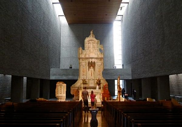
The "the pursuit of reductionist aesthetics" in Roman Catholic church architecture is more due to the suggestions of the Second Vatican Council than to "architects [being] uncomfortable with symbolic content and figurative art." Look carefully at the dates of the "uninspired" churches and you'll more likely find them from the mid-1960s onward. Plus there is the whole issue of cost versus budget--the money to build large/elaborate churches just isn't there anymore, along with the fact that the cost of building large/elaborate churches rose exponentially. The notion that architects and their modernist education is the blame for uninspired churches is simplistic at best.
2014.09.05 16:06
Why Modern Architecture Struggles to Inspire Catholics
Interestingly, the Roman Catholic Church I grew up within was very much a deterministic clockwork machine (for collecting tax-free dollars, among other things).
| |
2014.09.05 19.01
Why Modern Architecture Struggles to Inspire Catholics
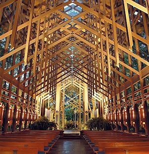
I walk in the woods for about an hour almost daily year-round. I've been doing it for almost three years now, and my appreciation of the beauty of the woods at this point in my life far surpasses anything I may have felt as a child. That being said, I've never liked the Fay Jones chapel, and it never occurred to me that that space was evocative of the woods, I think because the real beauty of the woods stems not from 'order' rather from the magnitude of its disorder. In the winter, when the trees are bare of leaves and there's not much sun in the sky, sometimes all you see is a nimiety of lines, I'm guessing thousands upon thousands of disordered lines seen all at once, and, what's fascinating is that among this great multitude and disorder you're still able pick out any individual crocked line. I've often wondered, "Am I seeing over a million different lines right now?" To me (and I rarely use the word because it has become virtually meaningless due to abuse) that's actually awesome.
As I already said, the Fay Jones chapel looks excessive[ly ordered] and un-necessarily busy.
2014.09.05 19:29
Why Modern Architecture Struggles to Inspire Catholics
EKE, my current understanding of the beauty of the woods stems entirely from my almost daily experience of the woods. It's just me giving some thought to what I actually see. However, I now also have reason to believe that the woods themselves harbor the beauty, well independent of any cultural 'teaching'. Every so often a friend (and fellow architect) joins me on my walks--so far I've taken him on all the different trails and different (parts of the) parks I go through. And on several occasions he will express a sensation about some particular spot that is identical to the sensation that I felt when I first experienced the same spot. The beauty is like inherently there whether anyone appreciates or not.
2014.09.05 20:10
Why Modern Architecture Struggles to Inspire Catholics
It wasn't that we both found the same spots beautiful, it was that the same spots elicited identical sensations, and not just visuals like a sudden vista, but also sounds (of the creek) and "feelings" one got in certain spots. For example, there is a spot on the path along the creek were the water babbling strikes one more distinctly than all the other points along the creek. I noticed it after passing it a few times and was very surprised several months latter when my friend immediately commented on the sound at the very same spot. I didn't mention anything to my friend at the time, but on all my subsequent walks there I wondered about what made the sound special there, so one day I decided to just stand there and figure it out. It turns out that the babbling sound(s) there are created by the water running over two separate lines of rocks across the creek with one line being about 20 yards downstream from the other. Thus, there is this 15 foot stretch along the foot path where you hear the babbling(s) in a kind of stereo. If you take your time and concentrate you can make out each distinct babbling emanating from each line of rocks, but, regardless, you cannot help but still hear them both at the same time.
14090501 Lauf Haus der Kunst plan 22002 NNTC/Ottopia context 2306i13
| |
2014.09.05 10:11
Why Modern Architecture Struggles to Inspire Catholics
Object lesson or (very short) period piece?

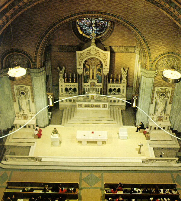
For the Philadelphia church of Saint Francis de Sales, Venturi & Rauch changed the focus from the original neo-Byzantine sanctuary to a new-liturgy arrangement by means of a kind of electric demolition (1968). As if they were making an editor's deletion on the statement of the original sanctuary, they literally drew a line through the old altar and its reredos, editing it out. That line is a cold cathode tube of light suspended on piano wire, ten feet above the church floor, following the gentle curve of the apse. The tube cancels out the old altar with the intensity of its electric light; yet the original statement can still be seen behind, as if in the distance.
This demolition is doubly literary in that, it is analogous to a deletion rather than being an actual one, and second, it alludes to literary or editorial procedures. In the "electric age" this is a pivotal example of the architecture of allusion. In addition, the result is a milestone of church art and a new church image. The decision to preserve the old altar was made by the architects because they felt that its jewel-encrusted craftsmanship should be retained as an expression of the church's historical continuity. That was a decision unlike the wiping away of historical ornamentation that was indulged in by the purgative "clean" designers of the 1950s. The architects also used the line of electric demolition to focus on the new furnishings of the new sanctuary. "The shape of the magic line cathode," as Venturi called it, is not the only element that defines the new sanctuary, of course, but it is the most supermannerist of the church's innovations. As other furnishings, the congregation required a lectern and a priest's chair in addition to the freestanding altar table. To match the new liturgy, the architects provided a completely new image for these furnishings. Three shiny objects of white plexiglass and white vinyl, with accents of yellow vinyl and plexiglass, are set amid the neo-Byzantine surroundings. The translucent soft-curved hard plastic panels and the soft hard-edged, wet-looking vinyl in a church look like Claes Oldenburg gone pious. The architects knew, as Venturi said, that they "could not get harmony through similitude" in these new furnishings because they could not afford, much less surpass, the richness of materials--marbles, jewels, and mosaics--that had been possible when the church was built in 1907. As a consequence, they sought "harmony through contrast." The plexiglass is similar to, yet contrasts with, the marble; the soft furniture contrasts with the usual church furniture yet has harmonious forms.
Unfortunately, that design image was too totally new for a large segment of the congregation of Saint Francis de Sales. Seven months after installation, "electric demolition" took on a double and sadder meaning when the congregation removed the cathode-tube light to a storage room. They thereby blindly demolished the architect's imaginatively allusive scheme, leaving only the acrylic and vinyl furniture intact.
C. Ray Smith, Supermannerism: New Attitudes in Post-Modern Architecture (New York: E. P. Dutton, 1977), pp. 256-8.
|
