2007.07.12 09:29
Sarcastic Architecture
Is sarcasm more of a dark comedy? (I always thought so.)
Is seminal post-modern pastiche also sarcastic? I suppose it did taunt establishment Modernism keenly (and perhaps even somewhat bitterly?). Although one could say establishment Modernism became much more embittered because of it.
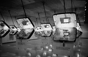
The D+S example above intrigues me the most. It is indeed taunting and you can almost taste the bitterness. (Not exactly architecture though.)
Perhaps Rossi haunts more than taunts.
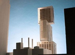
Does any sarcastic architecture wound feelings? The Eisenman West Avenue proposal (next to Ground Zero) seems to have that potential.
Has Koolhaas (subliminally?) made a whole career out of taunting and bitterness?
2007.07.31 11:36
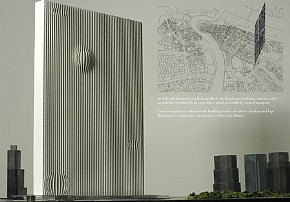
Learning from Las Vegas + SMLXL = Dubai
flip up

flip down
| |
2007.08.04 17:32
Koolhaas & Eisenman Discuss "Urgency" at the CCA
I thought the point was Archaeologies of the Future.
'Opaque' perhaps, but never without clues. The way I see it Koolhaas's architecture becomes him while Eisenman becomes his architecture. [Vanbrugh is at the top of the list if that helps.]
"Pejorativity" is an important chapter in The Irrelevancy Style of Architecture.
My tendencies are more coincidental than anything else.
2008.04.09 11:22
READING LIST
to clarify, when I wrote...
It may be well worth noting that the publication of S,M,L,XL closely coincides with the dawn of the easily-browsable/easily-publishable hypersized Internet. Ends and beginnings are both extreme situations
...it was in response to:
I don't think there's been a book [since S,M,L,XL] with such broad influence since. What do you think?
...meaning that, since S,M,L,XL, it's from the Internet that broad influence now emanates.
2008.04.09 12:11
READING LIST
You know, there are really only two different fonts used throughout S,M,L,XL. The size of fonts vary though; some are small, some are medium, some are large, and some are extra large.
2008.04.14 17:20
Architecture & intellectual property
I'm still not sure whether "Patent Office" within Content is legally serious or not, but it is a very good documentation of OMA/AMO's 'intellectual property'.
It's also strange how authorship is now-a-days sometimes seen as something negative, although 'intellectual property' is all about legal 'authorship'.
2008.05.19 20:47
The Official Paradigm Shift thread
After reading "Shifting Paradigm Part I" and "Shifting Paradigm Part II" (which really didn't impress me), Koolhaas's "Typical Plan" text came to mind. I'll read it again more carefully. I feel there might be some connection to 'generic-ness' and the decorated shed. Maybe not.
some great quotes though:
Typical Plan provides the multiple platforms of 20th-century democracy.
Typical Plan is minimalism for the masses.
Typical Plan knows what European architecture will never learn.
...it is architecture as mantra.
I'm secretly working on Plan Atypical.
2008.05.20 11:50
The Official Paradigm Shift thread
Many OMA and MVRDV projects owe a debt to Le Corbusier's Palais des Congrčs (1964, shown here with the exterior walls of the upper box removed). A generic stacked grid filled with a wide variety of program. Le Corbusier's 'baroque' reenactment of Villa Savoye, even.
The Heidi Weber Pavilion is a composite of (at least) two earlier (1949-50) design ideas: Le Brevet 226x226x226 and Porte Maillot 50. The various designs leading up to and the early designs of the Pavilion itself make for an interesting study in 'paradigm' development.
Sous les Paves la Plage, indeed.
| |
2008.05.30 09:17
Can you say canonical?
"In the Casa del Girasole itself, materiality replaces abstraction. The materials do not stand for anything; they are. At the same time, there is no dominant material system that suggests a preference for one material over another. Neither is there a color palette that makes any kind of structural or formal sense; the colors merely exist. This is a form of neorealism in architecture"
Peter Eisenman, "Critical Analysis: Luigi Moretti" in Peter Eisenman: Feints, (2006), p. 67.
But the real point will be:
Luigi Moretti, "The Value of Profiles", 1951.
Luigi Moretti, "Structures and Sequence of Spaces", 1952.
both reprinted in Oppositions 4, (1975).
I'm beginning to smell a bit of a 1970s reenactment...
"I remember Rosiland Krauss telling me "You with your surrealist shit", when she heard the word [delirious] in the seventies. It seemed the most efficient terminology to introduce at the time, even though the time was definitely hostile to it."
Rem Koolhaas (2006).
I think I'm telepathic because I often hear "You with your reenactment shit".
"Luigi Moretti's apartments on the Via Parioli in Rome: are they one building with a split or two buildings joined?"
Robert Venturi, "Ambiguity" in Complexity and Contradiction in Architecture. (1966).
The Church of Peter and Latter-Day Canonicals: is that multiple buildings joined or one building splintered?
2008.07.26 09:18
I smell a Vorläufer
"A further study of the main house resulted in two radical options: a vertical and horizontal house, both based on the same configuration. ... By turning our initial proposal 90 degrees a vast potential was discovered in which each space can have its own personal relationship with the landscape. What used to be a conventional patio becomes a centrally located multi-level living space which gives the inhabitants an unprecedented special experience and at the same time fits the very specific demands of the program."
--description of OMA's Ascot Residence (2003).
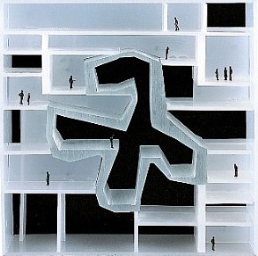
Wonder what would happen (if anything) when the above "nine plans" are flipped up 90 degrees. For example, a flipped-up 21st Century Museum of Art...
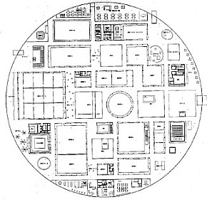 ...looks almost like this...

One easy way to conceptualize a new paradigm is to invert the "set of assumptions, concepts, values, and practices that constitutes a way of viewing reality".
...or just practice the twist in front of the mirror[-copy plan].
2008.05.19: "I'm secretly working on Plan Atypical"
| |
2008.08.13 15:38
has the sun finally set on oma?
This appeals to me. The overlay of generative elements and the resultant hyper-figure/hyper-ground.
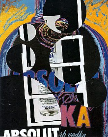 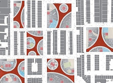
I like this too.
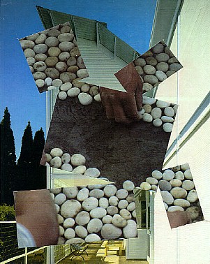 
2008.08.13 15:57
has the sun finally set on oma?
As to what's next, maybe this, or this, or this, or this. And there's always hope.
|