2013.03.13 21:40
13 March
I understand the differences and especially Koolhaas' parallel program strategy, and that's why I spoke of overlapping the two strategies to perhaps then come up with something even more rich.
2013.03.14 11:58
13 March
Coincidently read this in The Autopoiesis of Architecture early this morning:
"...and Rem Koolhaas's Delirious New York celebrating Manhattan's 'culture of congestion' and its 'critical paranoid method' of radical programmatic and stylistic juxtaposition. The phenomena that Koolhaas found in New York--congestion and random juxtaposition--were violating the prevailing Modernist principles." (p. 130)
It seems that "congestion and random juxtaposition--were violating the prevailing Modernist principles" could be said for Libeskind's collage as well.
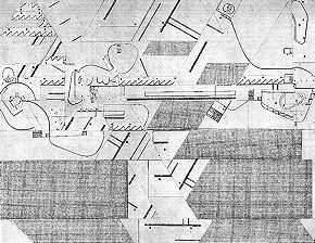
Maybe later today I'll take the La Villette plan and cut-and-paste it like a Libeskind collage.
While thinking of all this, I was reminded of something I wrote 2004.05.18 (for sure subliminally influenced by Koolhaas): "I like the list; like chapters, like lessons, like evolutionary stages, like different floors of a building I'd love to design, like a row of restaurants while you're perpetually hungry."
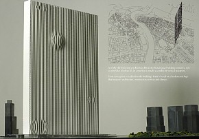
And finally, like the La Villette plan is the section of the New York Athletic Club flipped down, that tower for Dubai is an older Arab settlement flipped up.


Would the Libeskind collage make for an interesting building section?
2013.05.16 10:56
14 May
It's odd to think that Piranesi works like Koolhaas does, especially since it's certain Piranesi did not know Koolhaas. If Piranesi's hedonism is in the architecture...
2013.05.21 21:29
What are the cultural ingredients of architecture today?
form follows function
--well over a century ago
less is more
--four generations ago
You could say OMA's Content of a decade ago kind of mixed architecture with cultural ingredients.
crumble follows crumple
--something Orhan wrote last week
Has the recipe been rewritten lately?
| |
2013.05.22 11:28
What are the cultural ingredients of architecture today?
$ is a perennial ingredient of architecture. Is China building so much because now they have lots of money? Yes. Does Dubai exist because of lots of money? Yes.
Just did a google search koolhaas yes culture.
"Junkspace pretends to unite, but it actually splinters. It creates communities not of shared interest or free association, but of identical statistics and unavoidable demographics, an opportunistic weave of vested interests. … Its financing is a deliberate haze, clouding opaque deals, dubious tax breaks, unusual incentives, exemptions, tenuous legalities, transferred air rights, joined properties, special zoning districts, public-private complicities. Funded by bonds, lottery, subsidy, charity, grant: an erratic flow of yen, euros, and dollars (Ą€$)."
and
Let me ask you about your quote about the need to "accept the world in all it's sloppiness and somehow make that into a culture." Does this still reflect your current thinking?
Rem Koolhaas: Well, yes and no. Of course, behind every project we do there is a kind of vast critical apparatus of doing better. We're not trying to emulate the current mess. We are just as interested in the sublime. Actually, that is why I'm talking about the other buildings we are doing, because they are really exceptionally ambitious in terms of not emulating confusion or something, but ambitious as architectural works in and of themselves.
on architecture and capitalism . . .
Rem Koolhaas: I think what Mies tried to do is find a way to make the sublime compatible with capitalism . . . extract from capitalism the kind of elements that are sublime. . . . I think that the first real engagement with the aesthetics of capitalism is a kind of transcending it.
I think that after that, perhaps (Robert) Venturi and (Denise) Scott Brown were the second wave of looking at capitalism, perhaps with a greater sense of realism. The presence of capitalism and the results of capitalism were much more blatantly present, making it clear that you could almost not transcend it anymore, and you needed to find some accommodation with its aesthetics.
And I think that if you place Mies in the late 40's or early 50's, and if you place the beginning of the Venturi's thing in the late 60's or early 70's, then 20 years later of course globalization and the market euphoria become even more unfettered, and that is why I had to begin to look, with the Harvard project, at shopping, because I think that at that point almost all architectural production had contracted and focused on this one program, which in itself had morphed in such a way that it now included everything, all components. So for me, it was very important to address that, and also to see whether those demands had actually fundamentally changed the kind of spaces that we produce and the spaces that we need.
So you could say that the Venturi's are in the middle in terms of having a kind of positive relationship with the iconography of capitalism. Mies in a way stood above it, and Junkspace was a more internal look, when the positive attitude of the Venturi's was no longer tenable and where we had to admit and realize it was actually a much more ominous development. So, in a way, Junkspace is a theory, and what for me is very important about this building (the IIT Student Center) is that it tried to really work not so much within the same vocabulary but see what an architect could still do within that syndrome or within that regime.
You're so good at defining the reality of the world - the good things and the horrible things - that sometimes when I read your writings, it's very hard for me to see what you actually think about the things you're describing.
Rem Koolhaas: There are so many opinions in architecture. I think in the beginning it was just kind of exciting to describe and not to give so many opinions. If you read them (Koolhaas's writings), you also feel that you are in the presence of a very critical mind, or at least I hope so. Certainly in the case of Junkspace I think that should be overwhelming. But at the same time, I don't want to simplify things and say I'm against them when they have a degree of inevitability, but I would say our buildings are more and more able to really disconnect from those realities, or try to make the best out of them.
Is Bjarke "Yes is More" Ingels architecture's leading hipster?
Is "Design like you don't give a damn" implicit?
In perspective then: a monster[ous] grand tour[ism of] the real taboo domain.
Is Network Culture ever going to be a book?
"Look Bullwinkle, a message in a bottle!"
"Fan-mail from some flounder?"
Scripting. 3D printing. Ride the wave into the future?
"Architects inherently want to make the world a better place."
I attended a Denise Scott Brown lecture back in the (early-mid) 90s. She used the word 'boring" several times, as in, "Here's another boring plan." During the Q&A I wanted to ask, "So, are you trying to tell us that a bore is more?"
2013.07.08 22:08
Why is everyone bashing OMA and Rem Koolhaas?
...can you at least provide examples of how an OMA building is shallow, how an OMA design is frivolous, how an OMA design is self-indulgent, how exactly their buildings are poorly planned and designed? And who exactly are the pseudo-intellectuals and decadent elites that OMA panders to?
Perhaps I'm asking too much because bashing and actual criticism are not at all the same thing. Perhaps bashing is itself (by default?) shallow, frivolous, self-indulgent shite, poorly planned and designed. Suddenly I'm reminded that we are all mirrors that have to see ourselves regardless. Wow, what a bashing concept!
| |
2013.07.10 12:07
Why is everyone bashing OMA and Rem Koolhaas?
What the Seattle Public Library has done is add new dimensions (literally) to urban public space. If you think about it, there really are not many interior public spaces that are free to enter or free in the sense of non-commercial. Even government buildings now have layers of security that make them less openly public. Whatever the SPL may do offensively to the street it more than makes up for with the abundance of dynamic and engaging public space inside. Is there any other public space in downtown Seattle that can match?
2013.07.10 17:54
Why is everyone bashing OMA and Rem Koolhaas?
No where did I say or imply that if the inside is nice, then the outside doesn't need to be nice, thus I am not guilty of taking a cynical view of civic space. Now, after looking at large photographs (in El Croquis 134/135) of all four sides of the library, the outside doesn't look all that offensive; granted it's all large scaled, but the streets don't look like they're really suffering because of the building. So again, what the library has done is create a whole new dimension of free public space on the inside, and this is something that is increasing rare when it comes to urban public space (which is exactly why the homeless are attracted to the space--Philadelphia's downtown public library, a great beaux-arts pile, also attracts homeless people because there really is no other free indoor public space).
2013.07.12 18:36
Why is everyone bashing OMA and Rem Koolhaas?
... just before I read your post above, I read (in the Labyrinth preface), "As for Kafka's precursors, Borges's erudition takes pleasure in finding them in Zeno of Elea, Kierkegaard and Robert Browning. In each of these authors there is some Kafka, but if Kafka had not written, nobody would have been able to notice it--whence this very Borgesian paradox" "Every writer creates his own precursors.""
Because of this thread I have a whole new appreciation of the Seattle Public Library--"a genuine affordment of a covered liberal space." Is this really something of a rare manifestation in today's urban realm? Can the SPL be seen as a truly new paradigm of "covered liberal space"? Is commerce-free, covered liberal space even a viable urban typology? Yes, "it needs more thought."
2013.07.14 11:31
Why is everyone bashing OMA and Rem Koolhaas?
Literally 10 minutes ago I read, "A book which does not contain its counterpoint is considered incomplete."* And yes, immediately after that I thought about whether I could perhaps try to write that way...
There's a small account of a new OMA/Koolhaas designed, multi-million $, Korean residence/museum almost at completion in July's Vanity Fair magazine--which I read waiting in a dentist office. I'm sure that house will be 'News' soon. I wish I knew the Frick House (2001) better.

*Tlön, Uqbar, Orbis Tertius
| |
2013.07.14 12:10
Why is everyone bashing OMA and Rem Koolhaas?
Q: What comes after museum?

A: Pre-shrine
2013.07.15 13:34
Why is everyone bashing OMA and Rem Koolhaas?
March 1968 "A Significance for A&P Parking Lots, or Learning from Las Vegas" published in Architecture Forum magazine.
Fall 1968 "Learning from Las Vegas, or Form Analysis as Design Research" studio at Yale; 10 day spent in Las Vegas.
10 January 1969 LLV exhibit at Yale.
1972 Learning from Las Vegas published by MIT Press; Part III (in the first edition only) featured Venturi and Rauch projects from 1965-1971.
...you can read the rest of Koolhaas 2001 text here. I posted the quotation here as an example of an "out of the ordinary" Koolhaas text. Koolhaas and Orbist interviewed Venturi and Scott Brown in 2000 (at Geneva) and this interview along with the 2001 Koolhaas text probably provide a fuller picture of Koolhaas's thinking in this case. Also, Koolhaas with Venturi at the Vanna Venturi House.
It's been a long time since I looked through Harvard Design School Guide to Shopping.
|