2014.10.04 12:45
Sticks and Stones and all that Matter
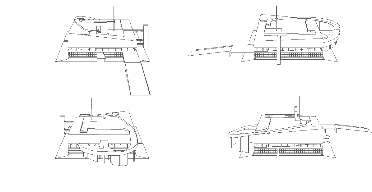
Agadir is more an offspring of Le Corbusier's Palais des Congres a Strasbourg (1964)--exchange level 3 and the roof of Strasbourg and you get Agadir.

2014.10.05 12:54
Sticks and Stones and all that Matter
Hopefully, I will soon conduct an experiment where the level 3 floor and ceiling planes of Le Corbusier's Palais des Congrčs ŕ Strasbourg are turned from flat to undulating. I'm fairly certain the resultant model will look virtually identical to OMA's Agadir's Hotel and Convention Center.
 
Above, level 3 of the Palais des Congrčs with flat floor and ceiling as designed by Le Corbusier, 1964.
Below, OMA's sketch of the socle of the Agadir Hotel and Convention Center, 1990.

OMA: "Our project can be read as a single building "split" in two parts, a roof and a socle. to create a major urban "room"--a covered plaza on the beach--facing the sea. Floating above the veranda; the hotel: a single layer of rooms--each its own patio house. ... The conference center forms the lower part, the socle. It was our challenge in this competition to find an original architectural expression for this enormous program which is compatible with the beauty of the site. The curvilinear landscape of the dunes continues as the "hills" and "valleys" of the socle..."
| |
2014.10.08 21:26
8 October
2011.10.03: When I look at the early graphics of Arquitectonica, I'm immediately reminded of Zenghelis and Koolhaas, hence, it appears the real inspiration came from the (new) architecture of Delirious New York, which isn't exactly a book pitching Deconstruction.
2014: And when I look at the more recent plans of Gigantis/Zenghelis, I'm reminded of the plans of Oscar Niemeyer.
2014.10.15
Domestic plans at Pruitt-Igoe, New Not There City
2015.03.21 14:01
Did any of you AIA lovers see this?
In terms of today's design and construction practice, can you provide an example of "faux-paint[ing] something to look like something else"? Do you mean like this:?

2015.03.22 09:54
21 March 3310k 3310l


Last night, finally got around to investigating and experimentally implementing the technique underlying OMA's Apraksin Dvor design, and while doing so it gradually . . . déjŕ vu.
| |
2015.04.22 15:51
Archinect's critical round-up for the new Renzo Piano-designed Whitney Museum
The notion of "beautiful in the way that a beautifully engineered piece of industrial machinery is beautiful" brings to mind one of the conceptual models of OMA's 2001 Whitney Museum Extension design (for the Madison Avenue site).

And, overall, it seems reasonable to assume that OMA's Whitney Museum Extension work (perhaps especially the design interpretation of the program) had some bearing on the New Whitney Museum design by Piano.

2015.04.23 10:36
Archinect's critical round-up for the new Renzo Piano-designed Whitney Museum
...assuming you're in NYC, do you have any thoughts on how the New Whitney Museum compares with the New Museum? I'm just curious, as I only know these buildings from pictures. For example, is the New Whitney much larger than the New Museum? (--if I were to just guess, the New Whitney seems about double in size.) Does the New Whitney lack the "aesthetic refinement" of the New Museum? Since both these new museums are 'stacked' (Koolhaas's "culture of congestion"?), I imagine there's something to learn from a compare/contrast.
|