2000.04.23
more
...list of directories... ...almost, infrastructure, annexation, facade, trend, physiology, morphology, iconoclasm, infringement, nimiety.
2005.04.23 12:09
AN ARCHITECTURE OF REMOVEMENT
"If someone in the museum was truly interested in my work they would let me cut open the building. The desire for exhibiting the leftover pieces hopefully will diminish as time goes by. This may be useful for people whose mentality is oriented toward possession. Amazing, the way people steal stones from the Acropolis."
Gordon Matta-Clark, February 1978.
2006.04.23 10:32
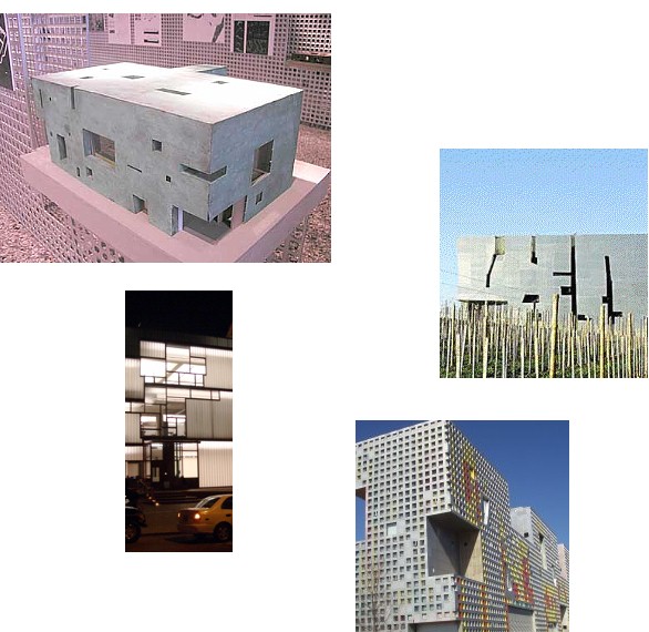
Steven Holl's building facades and urban patterns

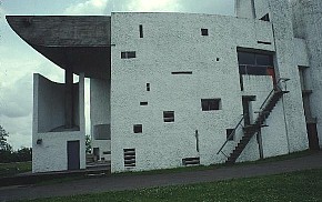
You know, I always wondered what the urban pattern of Ronchamp was.
2006.04.23 12:45
Steven Holl's building facades and urban patterns
There doesn't seem to be any denying that Holl looked at and continues to look at the historical precedent of Le Corbusier's Ronchamp. Architects don't like to reveal their inspirations, so the bullshit starts coming out instead. The bullshit is essential to keep the myth of creative genius alive.

"A lecturer of mine told me that Holl draws from the urban patterns of the site for the facade articulations of his buildings. Is this true? In any case, I don't see the justification. Can anyone shed some light on this?"
| |
2007.04.23 15:41
Featured Discussion: Volume
It seems to make sense that de-territiorialization ultimately registers a re-territorialization, but it is the effect of de-territorialization (on one's thinking) that is the most important aspect here. And I guess you could say that new mode of thinking is what then shapes the new "territory".
I have no idea if this is so, but I wonder if this composition might be an example of de-territorialized architecture.
2007.04.23 17:08
Featured Discussion: Volume
Firminy church by Le Corbusier
Hurva synagogue by Kahn
composition 1a : the act or action of composing : the formation of a whole especially by different things being put together
To confuse or not to confuse, that is de-territorialization?
The church/synagogue composition came as a result of seeing how the plan of the church fit almost perfectly within the sanctuary(?) of the synagogue. And, since I had a model of both buildings, I just wanted to see the superimposition in 3D. And upon seeing that I thought, "Gosh, that kinda looks like a mosque." Trust me, de-territorialized thinking isn't necessarily brilliant, although for the most part uninhibited.
Anyway, back to Volume....The reporter on the radio just said, "Heavy volume on Passyunk Aveune..." Hey, traffic would make a great theme for a heavy issue. Trafficking in Architecture--I wanna write about stolen goods.
I think Passyunk is an old 'Indian trail'. Wow, Philadelphia's Indian trails, talk about de-territorialization.
2007.04.23 20:46
Featured Discussion: Volume
"It turns out that humpback whales riff off each other, remixing one another's songs, and developing trends and fashions in their singing over time." Who told them about composition?!?
09042303 Ichnographia Quondam section 8 model 2392i87
12042301 William Jeanes Memorial Library scan plan scaled 2402i05
12042302 William Jeanes Memorial Library sections, elevation scaled 2402i06
12042303 Acadia National Park Headquarters Building scan plan scaled 2402i07
12042304 Acadia National Park Headquarters Building scan section scaled 2402i08
12042305 Trenton Jewish Community Center Bathhouse plan with circle/square junctures 217bi00
2014.04.23 13:00
Philip Johnson Was a Nazi Propagandist
Perhaps from now on a story like this will arise every time a Johnson building is featured in the mainstream news. What's weird though is that it's as if a Johnson building getting mainstream media attention is automatically equal to a Johnson building getting "good publicity," but "good publicity" is not allowed for anything that has an association (however remote) with Nazi sympathies. If the New York State Pavilion wasn't in the current news, the article would not have happened. It's the combination of strange (guilt by) associations that harbor their own kind of almost perniciousness.
Johnson's domestic architecture of the 1950s makes for an interesting study, especially in relation to what Kahn was doing with domestic architecture at the same time, and what Le Corbusier started doing subsequently. I like the Wiley House, despite what Venturi wrote:
"In the Wiley House, for instance, in contrast to his glass house, Philip Johnson attempted to go beyond the simplicities of the elegant pavilion. He explicitly separated and articulated the enclosed "private functions" of living on a ground floor pedestal, thus separating them from the open social functions in the modular pavilion above. But even here the building becomes a diagram of an oversimplified program for living--an abstract theory of either-or. Where simplicity cannot work, simpleness results. Blatant simplification means bland architecture. Less is a bore."
Wow, I never imagined bad publicity could be so much fun (to rewrite).
2014.04.23 13:10
23 April

| |
2014.04.23 14:00
Philip Johnson Was a Nazi Propagandist
But there is definitely enough 'room' in cyberspace to build a museum for every atrocity.
2014.04.23 15:38
Philip Johnson Was a Nazi Propagandist
Actually, the more I investigate and study the architecture of Philip Johnson, the more I find a very good if not also somewhat rare architectural talent. He's certainly not an architect's architect, but he's very much an architecture's architect, and that's where the rareness of his talent lies. Look at this quotation from Kramer's article (linked above):
"...what characterizes his work is a series of brilliantly performed charades in which other people’s ideas, other people’s tastes, and other people’s styles have been appropriated, exploited, deconstructed, and repackaged to advance the prosperity of his own reputation and influence." Take away the notion of charade (because Johnson was never trying to fool anyone about the character of his designs) and the notion of advancing his own reputation (because Johnson was more concerned about the advancement of architecture) and we're left with: "other people’s ideas, other people’s tastes, and other people’s styles have been appropriated, exploited, deconstructed, and repackaged" which is not something particularly easy to do because it requires a very sharp eye and a very facile imagination (toward manifestation) which is exactly what amounts to talent
14042301 Zany House 001 plan 22002 context 2248i04
14042302 Zany House 002 plan 22002 context 2249i02
14042303 House in Laguna 001 plan 22002 context 2267i06
14042304 5233 Arbor Street plan 22002 context 2166i24
14042305 Battery Park City plan 22002 in situ 2254i03
14042306 City Hall Redux plan 22002 in situ 2255i01
16042301 Museum of Shadows plans working model site plan 2200x1100 Campo Rovine IQ60 2452i04 b
17042401 Altes Museum model GAUA site plan 1100x550 plans model w/porch elevation 2120i51
18042301 Flick House I site plan plans section 2333i02
18042302 Weishaupt Forum plans elevations sections 225ji01
18042303 Weishaupt Forum plans elevations sections layers organized 225ji02
18042304 Un Pavillon d'Exposition plans elevations sections 219ai01
18042301 OMA Lab City Paris
18042302 OMA Hanwha Galleria Gwanggyo
19042301 IQQ24 model work 2468i72
20042301 Maze House wireframe work image 229li03
21042301 Breslauer Platz plan model work 2228i05
|