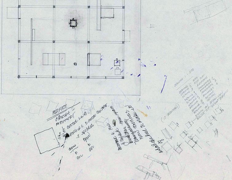
Close-up of John Hedjukĺs Plan with notes for Texas House 5, 1954-1963. John Hedjuk fonds, CCA. DR1998:0051:001
Most things I read by architects feel like empty provocation or some form of self-promotional spinŚeven this, even that. Nowadays I simply prefer buildings and drawings, looking at images and things; calculated vagueness and beauty over clarity and argumentation. I prefer the mundane habits of an architecture office over the hyperbolic narratives of press releases. I like sitting in the office looking at other buildings in books, sketching, and making lists (lists are more making than writing). I constantly make lists. They are practical: to remind me. They need not follow writerly etiquette or rules of grammar. Lists are not composed as a narrative; they are never complete, but also never incomplete. They are cut and pasted, personal yet authorless.
When making lists, I tend toward a single long list over multiple small lists. They are written, deleted, and rewritten constantly. To-do lists, mostly, but also lists of stuff, groceries, events, deadlines, books to read, pdfs to collect, random things to remember, old buildings to look at more closely, new buildings to see, funny expressions that sound interesting at the time, potential titles for something unknown, images. . . .
Presented unedited--lists are always better left unedited--a snapshot of a list made sometime in March 2018, before visiting the CCA to browse the John Hejduk fonds:
Other Possible Titles: ôCollectedSelectedEdited,ö ôRelative Relations,ö ôWhat-ever,ö ôObject, Exhaust,ö ôVarious Things of Different Sizesö . . .
Drano, Strap Wrench, 10ĺ Ladder
Return McMaster order, duplicates
Fix door
Kahn, Shapiro House (1st proposal), Plan
Gehry, Wagner Residence
Siza, FundašŃo Iberŕ Camargo
Order 1/8 metal drill bit for install
Call Jim
Order Shades
Eggs, Raspberries, Basil, Tea,
Finalize House Proposal, Present next week
Read There There
Complexity and Contradiction and Mom
Sell Old Monitors, Craigslist. $80/ea, 4 left
Samsung beeper for Alice
Helskini_render5_reject.jpeg, maybe okay.
Watch Alone in the Wilderness (YouTube)
Trash No.1 $3.00? 99ó?
Review Ep. 5 River Monsters, TV Guide
Architecture Camp snack bags and emergency blanket
ôAesthetics of Indifference,ö email pdf to Stan
LED finger lights
Python 8.5
Reserve Pet Lodge
Find Hotel
4 days MontrÚal, Hejduk (CCA archive), Write 1,500ish words
| |
For those who havenĺt been, CCAĺs archives (aka ôthe vaultsö) are part fantasy, part bureaucracy; a warehouse that shelves and catalogues architectsĺ ideas, everything neatly filed away in grey boxes and manila folders. It could have been written by Borges and filmed by Kubrick. Itĺs a perfect space for John Hejdukĺs work, which is a sort of pre-archive archive, a list of things, a collection of characters, a grid of ideas, a thinking about identity, language, and structure. Projects are meticulously itemized and catalogued, pages filled with words repeated and rearranged. Throughout the many folders of drawings and sketches there is a consistently repetitive, rhythmic, and rhyming quality to the work.
Excerpts of my CCA notes, out of order:
AP145.S2.D28 Element House
Iĺve never seen this before . . .

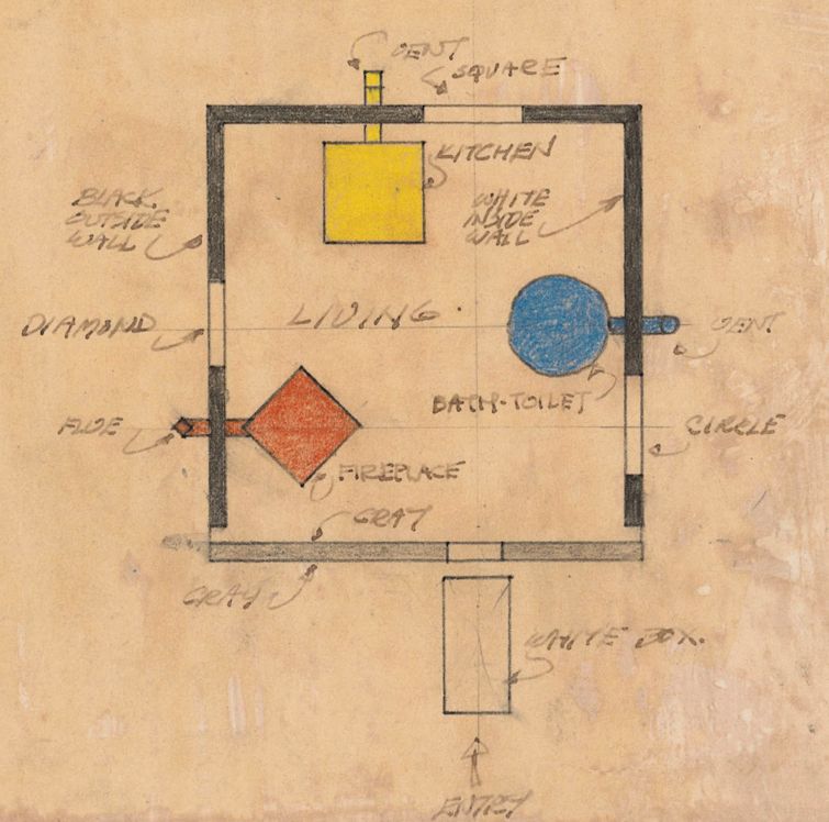
John Hejduk. Sketch plan for Element House, 1968-1974. John Hejduk fonds, CCA. DR1998:0082:004

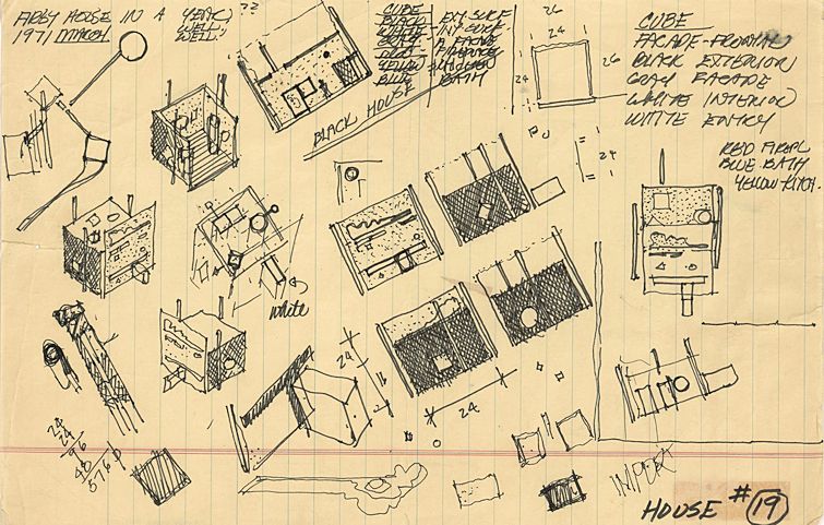
John Hejduk. Sketches with notes for Element House, 1968-1974. John Hejduk fonds, CCA. DR1998:0082:001
A. A collection of shapes. . . . 1 large square. Inside the large square there is another square, a circle, and a diamond (respectively, a kitchen, fireplace, and bath/toilet). All the shapes are the same size, and all are coupled with either a vent or a flue. The shapes of the vents and flue match the shapes of the objects theyĺre attached to.
B. ôMondrian.ö
C. DeStijlish or Rietveldish. Only not in planes, but volumes. The bathroom is the same size as the fireplace, the same size as the kitchen. Nothing touches, or barely touches.
D. The plan shows a thick square, where three sides are black and one is gray (the front). Frames a Red Diamond (Hearth[CR3] ), Yellow Square (Kitchen), Blue Circle (Bathroom). Across from each element is an opening in the surrounding wall. Outside the square frame is a White Box (Entry) which looks like a door turned horizontally. . . . Playing with volume and orthographic projection.
E. The game is compositional elements are simultaneously pulling away and gathered together
F. The drawings feels old, antique. They have a sepia qualityŚperhaps from 1920, perhaps an early modernist forgery.
G. 15 Arrows. (The entry arrow is different, hollow.)
H. Everything is annotated.
I. ôThat is Thatö
|
