1998.12.02 11:20
Re: def: AutoCAD Architecture
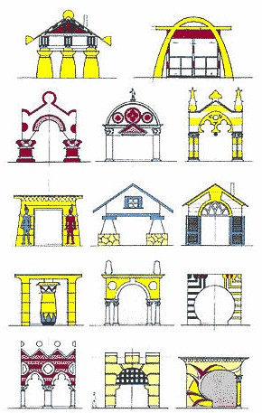
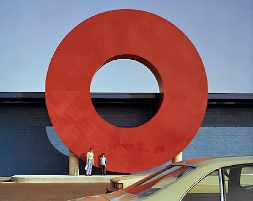
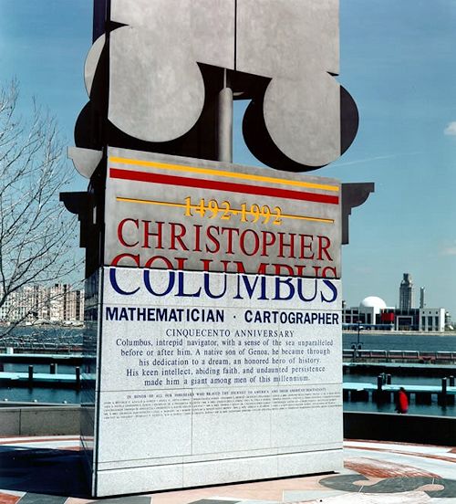
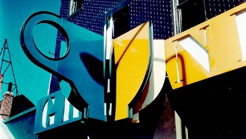
With regard to "flatness", take a look at Louis Kahn's first independent building commission--Ahavath Israel Synagogue, Philadelphia, 1935-7. My point being that "flatness" is an architectural aesthetic with a long history and very much independent of CAD. There are also some Venturi, Scott Brown and Associates buildings that absolutely revel in their flatness, e.g., any of the 1980s and 1990s university laboratory buildings. I also suggest you read Tom Wolfe's The Painted Word, within which you will find an analysis of the flatness of 1960s POP art.
2000.12.02
aesthetics? (etc.)
I'll touch upon Rick's insightful focus on Jasper Johns Flag on Flag illustration because it represents Venturi's relationship with POP Art taking precedence over Venturi's relationship with popular culture. The whole aesthetic notion of POP Art flatness (as best described in Tom Wolff's The Painted Word) is an aesthetic that Venturi still to this day strives ardently toward in many aspects of his designs. This 'style' is rarely, if ever, discussed within the plethora of writing on or by Venturi, yet it is definitely a substantial part of Venturi's design psyche. Let me explain further so as not to begin sounding like, as Alex once described, Kenneth (Civilization) Clark when he (Clark) was adamant about what Michelangelo "must have thought." One of my best friends, RE, a former Temple U. classmate, was an associate at Venturi, Scott Brown & Associates for 10 years. Whenever R and I discuss the 'flatness' issue, it gets very intense; R offers lots of actually working examples of the quest for flatness in the design process, and then we inevitably agree that it is somehow amazing that hardly anyone (else) knows about this very integral component of Venturi's style.
2005.06.08 16:09
any art history majors/undergrads?
You know, it might actually be that art lags behind architecture. I'm not in a position to get into any specifics right now, but let me at least make the suggestion that it is most likely easier for an architect to pick up art history to some depth than it is for an artist to pick up architecture history to some depth.
Like I say, I'm just making a suggestion.
2006.03.04 12:18
Iconography, or the problem of representation
The surface examples I listed are within the context of electronic screens on buildings, and not meant to imply that iconography cannot have depth as well. Nonetheless, an architecture of just camouflage seems to be an interesting typology.
The main reason for the post, however, was to address the notion of architecture as delivery of content, which was (subsequent to quondam) also addressed by Willem-Jan Neutelings in Icon magazine (January 2006).
Architecture as delivery of content seems to be the opposite of architecture of just camouflage, doesn't it?
2006.03.06 12:13
Iconography, or the problem of representation
'Wallpaper' can be applied both inside and outside, can it not?
Is there some kind of law dictating that 'wallpaper' can only be applied to flat surfaces?
2006.03.18 11:11
"Breaking The Japanese Grid"
Adso, you say:
"I tried to dissuade students of the notion that program was a list of functions and square footages by getting them to think of program elements as verbs instead of nouns- a place for sleeping instead of merely a bedroom."
A place for sleeping and a bedroom don't really sound all that different to me because it's still just applying a function to a space.
[It seems] the point of Japanese architecture of the 16th century is that one could well choose to sleep in the moon viewing room or choose to sleep in the breeze catching room, or choose to sleep in the fragrant room etc. The same would go for eating, reading, (cooking?), etc.
And if all the sliding wall panels doubled as flat screen monitors, then you could watch TV anywhere too.
I wonder what verb best describes this type of thinking.
| |
2006.03.29 11:56
Depth
"The whole aesthetic notion of POP Art flatness (as best described in xxxx) is an aesthetic that Venturi still to this day strives ardently toward in many aspects of his designs. This 'style' is rarely, if ever, discussed within the plethora of writing on or by Venturi, yet it is definitely a substantial part of Venturi's design psyche. ...offers lots of actually working examples of the quest for flatness in the design process, and then we inevitably agree that it is somehow amazing that hardly anyone (else) knows about this very integral component of Venturi's style."
--QBVS2, p. 50.
2006.03.29 18:25
Depth
I realize that flatness is not the "opposition notion" that you are looking for. I just wanted to provide historical context to your question(s).
(I'm kind of just guessing, but) Venturi may too have seen "that a characteristic of modern architecture, is a move away from depth" and thus worked to exploit that very aspect in his designs. Venturi may too have been inspired by the contemporary architecture being built in Rome while he was at the American Academy in the early 1950s.
One could also say that Kahn earlier introduced "depth" via volumetric geometrics and the "cut-outs" thereof, which, for a while, influenced Venturi and later Matta-Clark.
2006.05.10 19:26
Depth
Louis I. Kahn, Yale University Art Gallery, 1951-53.
Louis I Kahn and Anne Tyng, City Tower Project, 1952-57.
The geometric studies of Kahn and Tyng from 1951 to 1957 may have a strong bearing on "depth" as per the initial post/query of this thread.
Louis I. Kahn, Jewish Community Center (Trenton Bath House), 1954-59.
Colin Rowe and Robert Slutzky, Transparency: Literal and Phenomenal, written 1955-56.
Louis I. Kahn, Salk Institute for Biological Studies (Meeting House with volumetric cutouts, 1961), 1959-65.
Colin Rown and Robert Slutzky, Transparency: Literal and Phenomenal. first published in Perspecta, 1963.
2007.01.13 11:57
any suggestion about Manual DeLanda cousrse in Upenn
Maybe it's because they're not all that well read to begin with?
or
Maybe it has something to with modern culture's preferred lack of depth?
or
Maybe it's because tuition is so high that it must be worth the price?
or
All of the above and more?
2009.03.17 17:10
Making it/Thinking Architectural
architectural history flattened

architectural history reduced to a few lines
| |
2009.11.18 11:31
The current state of Architectural Theory
...it's not that "there really isnt meant to be any real thought there" but that "intellectual rigor" really isn't necessary to design architecture. In fact, it could well be asked: Does it really behoove us to mask our lack of depth and our inability to achieve real, effective, incisive strength in our work with intellectual nonsense? A lack of depth and an inability to achieve real, effective, incisive strength are not fixed with intellectual rigor, rather they are fixed via design rigor. The architectures of Zumthor, Predock and Chipperfield (for example) do not stand out because of their intellectual rigor, but because of their design rigor.
Yet design rigor isn't always necessary to create architecture either. Gehry's architecture exhibits a very high-grade design facileness, and maybe that is indeed something rare.
As for the "computer people", the various/sometimes architectures of Hadid and UnStudio (again for example) well demonstrate being beyond "figuring it out", and they're even doing it rigorously.
I'm not here trying to express my opinion, as much as I'm experimenting with establishing some kind of baseline for architectural theory to build upon. I am of the opinion, however, that honesty, or at least objective observations and assessments of present conditions, is a fair place to start
2013.07.31 15:25
Thread Central
A line on a plane is a two-dimensional entity. Once the plane (with a line on it) is turned into a möbius strip, then the plane becomes a three-dimensional entity and the line on the plane also becomes a three-dimensional entity.
Think of an architectural plan on a sheet of paper. As long as the paper is laying flat the paper and the lines on the paper are two-dimensional. When you roll up the paper, then the paper and the lines on the paper are three-dimensional.
2014.03.17 13:22
17 March
Coincidentally typed this morning:
There is a profound "immobility" in the technological world which science fiction writers have often portrayed as the reduction of every experience of reality to an experience of images (no one ever really meets anyone else; instead, everyone watches everything on a television screen while alone at home). This same phenomenon can already be sensed in the air-conditioned, muffled silence in which computers work.
Flattened out, simultaneous, the world appears de-historicized. What made up "modern"--i.e. the experience of living every day in a narrative history of progress and development reinforced by the daily newspaper--now comes to a halt. The "master" narrative, once a secularization of religious salvation, now fails, and multiple other possible narratives rise up."
--Gianni Vattimo, quoted in "Postmodern or Posthistoire?"
Are the Koolhaas/OMA instances of Ichnographia Campus Martius usage also examples of "history flattened"? Is the Ichnographia Campus Martius itself an example of "history flattened"?
Read again last night the Vidler/Eisenman conversation in Log 28. Vattimo came up a bit.
It's becoming more and more clear that lots of the fuel that burned Tafuri's contemporary-architecture-critique fire came from Scully's early 1960s writings. And, judging from a comment I once saw/heard Scully make about Tafuri, I think he already knew it.
2014.10.05 12:54
Sticks and Stones and all that Matter
Hopefully, I will soon conduct an experiment where the level 3 floor and ceiling planes of Le Corbusier's Palais des Congrčs ŕ Strasbourg are turned from flat to undulating. I'm fairly certain the resultant model will look virtually identical to OMA's Agadir's Hotel and Convention Center.
2015.02.13 16:13
This is Why We Can't Have Nice Things
Regarding "the depth of architectural debate today" it seems like so the building, so the criticism. Yes, they match here, don't they.
"I'm just starting to read a collection of critical essays on James Joyce, and so far it's interesting to see how Joyce's unique creativity seems to induce a creativity from the essayists that they might not normally have. I've sometimes noticed a similar effect when reading critical essays on Duchamp. Philippe Duboy's Lequeu: An Architectural Enigma is perhaps the apotheosis of this kind of critical effect creativity.
Is it then a fair hypothesis that one's critical deliberation of a unique creativity might well engender an as yet uncommon creativity from oneself?"
| |
2015.05.01 16:34
Odd Architectural Details

demolished 1998
2015.05.01 16:40
Odd Architectural Details

Still wonder if there will ever be a concise study of Venturi's 3-dimensional design of 'flatness'.
2015.05.01 16:47
Odd Architectural Details
for example...

2015.11.07 12:30
Reinier de Graaf: "The western architectural ivory tower has become a theatre of the absurd"
There is no real evidence that BIG, ZHA and FOG do not or cannot seek "beauty, joy, delight, function, wonder, solace, serenity, fun" in their work. Nor is there any real evidence that being a "brand" limits one's work from "finding real depth." What exactly are the unnecessary constraints created by branding?
|