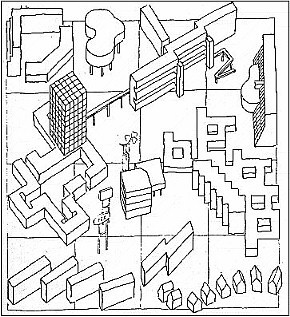
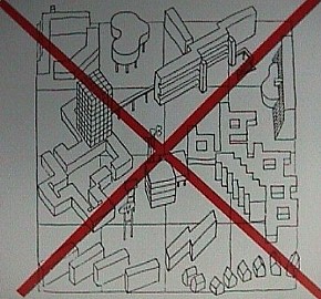
Leon Krier, Urban Components (In Plan and Silhouette) (1976).
The zoning of modern cities has resulted in the random distribution of both public and private buildings. The artificiality and wastefulness of zoning has destroyed our cities.
Leon Krier, "Leon Krier - Houses, Palaces, Cities," Architectural Design, vol. 54, no. 7-8, 1979.
In his effort to illustrate the ill effects of a modern zoning that caters largely to particular ends rather than acting in deference to a wider context, Krier chose to diagrammatically represent both the haphazard placement of buildings as well as the excessive pluralism of late-modern architectural design. Furthermore, the superimposition of a bold red "X" over the diagram 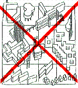 makes it visually obvious that Krier wishes to negate this condition. makes it visually obvious that Krier wishes to negate this condition.
Although inauspicious, Krier's sketch, nonetheless, inadvertently provides what is essentially a rare pictorial interpretation of the real condition prevalent in today's built environment. Thus, when looked at in a slightly positive light, and without much further use of the imagination, Krier's simple sketch readily becomes what may best be described as a virtual museum of desultory late-twentieth-century architecture.
Stephen Lauf, Precedent XI (Quondam: seeking precedents... ...finding inspiration exhibit, 1997.03.20).
| |
|
(Stirling's) Urban Components
1976-1988
|
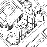
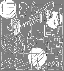
Within Leon Krier's diagram of Urban Components of 1976 there are a few not so subtle references to the architecture of James Stirling, and, therefore, the overall negative tone of Krier's drawing is also an indirect critique of Stirling's modernist architectural style. Krier was once closely associated with Stirling's architectural practice, and indeed was the delineator of many Stirling designs. The association ended on less than positive terms, however, and therefore Krier's diagram may also be a reflection of that unfortunate occurrance. Stirling, on the other hand and not to be outdone, twelve years later takes one of the buildings within Krier's diagram and applies it to his Seville Stadium Development design of 1988, thereby adding an ambiguous symbioses between precedent and inspiration.
Stephen Lauf, Inspiration XI (Quondam: seeking precedents... ...finding inspiration revised exhibit, 1998.11.03).
| |
|
| |
2003.01.10 19:02
Re: the dead end of urbanism as we know it
Urbanism
Architecturism[?]
Spacism[?]
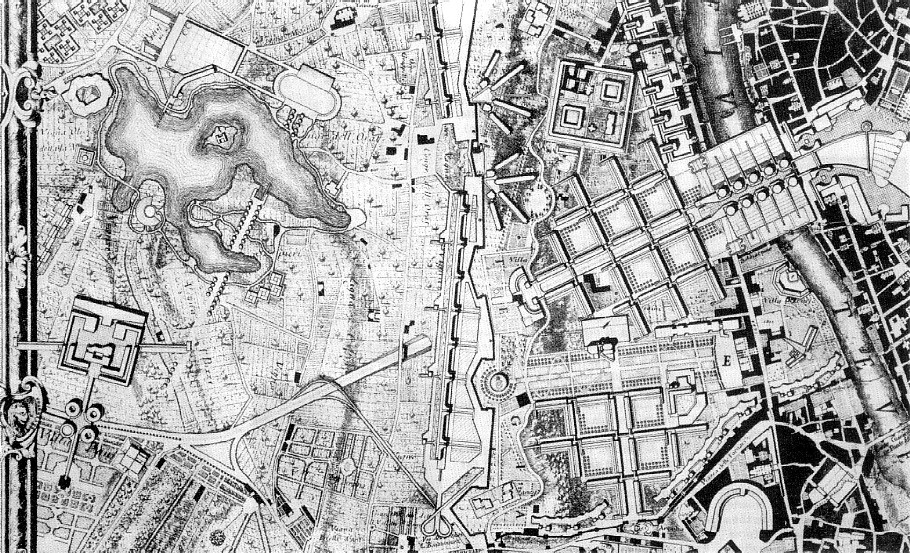
Check out Le Corbusier's plan for rebuilding Berlin (1958, a few years before the wall) at the end of volume 7 of the Oeuvre Complete. In retrospect, it is almost bizarre in its intentions. Note the reenactment of Chandigarh's Great Assembly next to the Reichstag! And the gigantic pronged towers scattered in the east. Urbanism, architecturism and spacism all in one plan.
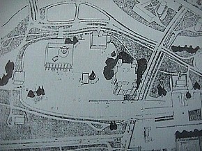
It's funny. I really like this plan, and would love to see it executed, but not at the cost of losing Berlin in the process. If Disney, for example, ever wants to (again) do a great thematic 'FutureTown' (they actually called it TomorrowLand, didn't they?) they should simply enact this plan, and maybe put a big wall around it. I think I'd even like to live there. A kind of beyond virtual Berlin, like a new double Berlin, again.
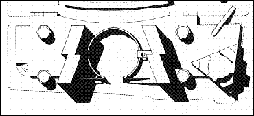
And here's something that's really interesting in its obscurity. Remember all those little sketches depicting bad modern building design that Leon Krier used to draw as contrast to his 'good' designs? I'm betting big money that Krier actually used the axonometric of Le Corbusier's Berlin plan (OC, vol. 7, p.234) as 'inspiration'. The 'lightening-bolt buildings just south of the Tiergarten are a dead give-a-way. Now I know why I always thought those sketches were actually the best buildings Krier ever designed.
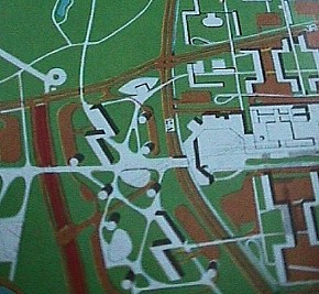 
| |
2003.01.11 13:29
Re: the dead end of urbanism as we know it
Here are some digital snapshots of Le Corbusier's plan for Berlin, 1958, plus a sketch by Krier and a project by Stirling/Wilford.
 Chandigarh and Reichstag
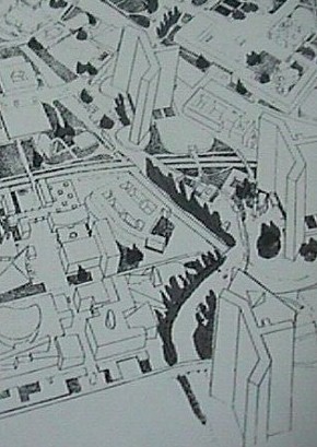 gigantic towers in the east
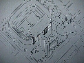 1988: Seville: Stadium Development lightening-bolt buildings
|

 makes it visually obvious that Krier wishes to negate this condition.


 gigantic towers in the east
 1988: Seville: Stadium Development lightening-bolt buildings