2013.07.30 10:29
Learning from Learning from Las Vegas (again)
A sentence within the last paragraph of Scott Brown's 'Preface to the Revised Edition' (1977) gave me pause:
"We feel too that architects, bar a few diehards, are coming to realize that what we learned from Las Vegas, and what they by implication should learn too, is not to place neon signs on the Champs Elysees or a blinking "2 + 2 = 4" on the roof of the Mathematics Building, but rather to reassess the role of symbolism in architecture, and, in the process, to learn a new receptivity to the tastes and values of other people and a new modesty in our designs and in our perception of our role as architects in society."
Pause because I immediately thought of two instances where work of 'the firm' appears to contradict what should "not" be done.
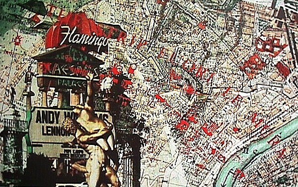
Venturi and Rauch, Roma Interrotta: Sector VII (1978).
Neon signs at the Roman Forum? Perhaps not just that, but also an indication of how the Las Vegas billboard is 'today's' symbolic equivalent. Maybe, maybe not, or perhaps the Rape the the Sabine Women scupture up in front subliminally delivers a more potent symbolic message. Anyway, the fact remains that Venturi and Rauch sought out this particular section of the Nolli map--"One of the last episodes between Giurgola and Venturi occurred at the very beginnings of Roma Interrotta. When each of the invited architects received their section of the Nolli map of Rome, they also got to see what sections the other invited architects received. The Venturi office preferred the section received by the Giurgola office, so the Venturi office asked the Giurgola office if they wouldn't mind exchanging sections. The Giurgola office said they'd be happy to exchange, but they would rather ask the Roma Interrotta people before doing so. The Roma Interrotta people said the exchange was OK, and the rest is architectural history." "I still remember what Brigitte Knowles (the blonde student you see in one of Kahn's classes in My Architect, and in 1978 one of my teachers and my employer) told me after returning from Rome and having there seen the Roma Interrotta exhibition: "Venturi's boards were terrible, really a disgrace. They just pasted some Las Vegas stuff on the Nolli map, and that was it. I think they are now finished.""
Working title: Learning from Mixed Messages.
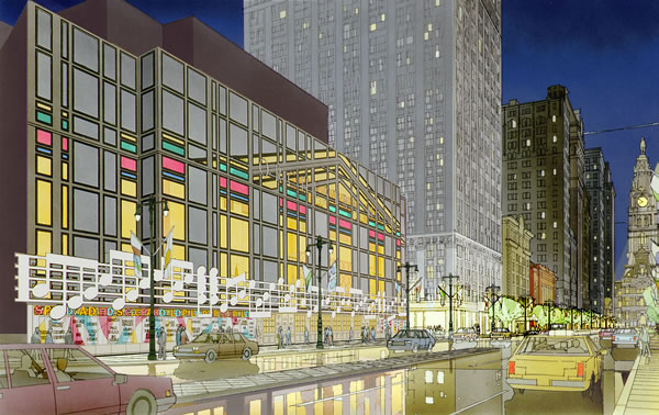
Venturi, Scott Brown & Associates, Philadelphia Orchestra Hall, second scheme (1987-96).
A bar of orchestral music on an orchestra hall? Personally, I thought this was just plain pathetic when I first saw it. This commission turned out to be a sad loss for the firm.
One can well conclude that "a new receptivity to the tastes and values of other people" actually boils down to opening a very unpredictable 'can of worms'. And, for all the seemingly positive talk of "a new modesty in our designs and in our perception of our role as architects in society" there is still a somewhat elitist aesthetic filter.
| |
2013.02.15 11:28
What are architects immediately critical of when entering a building?
I'm writing a movie about a sharp-witted, film-analyzing architect who finds a traveling, web-trolling film writer stealing all her design ideas. Working title: She Said She Said.
2013.02.16 13:20
What are architects immediately critical of when entering a building?
I'm pitching the script as Fassbinder meets Midnight in the Garden of Good and Evil--creating a new genre even: the fashion police action film. Playing with a new title, but can't decide on Days of Daze or Daze of Days. Hey, maybe Go Figure!
2013.04.27 16:38
Why has the house lost its power?
Perhaps "no professor will ever bring up a house published on dezeen.com" because that will undermine the hyperbolic cost of architectural education.
My mind just started to wander because I'm now imagining a bitingly ironic book entitled You Get What You Pay For.
2013.04.30 09:37
Hitler's Words Into Stone. Can architecture itself be fascist?
I hear Wolfhilde von Schlittenfahrt is working on a book entitled Architecture as a Glorious Whole. No doubt she'll do it justice. I bet the last chapter is called "The Narrow Escape."
2013.06.16 10:21
Pritzker jury will not revisit decision to exclude Denise Scott Brown
Perhaps the collaborative work of Robert Venturi and Denise Scott Brown embodies "the obligation toward the difficult whole" indeed.
The last chapter of Complexity and Contradiction in Architecture is "The Obligation Toward the Difficult Whole," and it at the very end of that chapter where the tone suddenly changes. [In a conversation I had with Mark Wigley late November 1999, Mark was convinced that Scott Brown was very much responsible for the sudden change of tone in the last chapter of Complexity and Contradiction, saying there was even evidence of this within the Complexity and Contradiction manuscripts in the MoMA archives.] The Museum of Modern Art published Complexity and Contradiction in Architecture in 1966, but actual distribution did not occur until March 1967. Venturi and Scott Brown marry 23 July 1967.
Scott Brown collaborates with the then brand new firm Venturi and Rauch on the Monumental Fountain on the Benj. Franklin Parkway Competition in 1964. "...I thought about Scott Brown's first association with Venturi and Rauch, the competition for a Monumental Fountain on the Benjamin Franklin Parkway (1964).
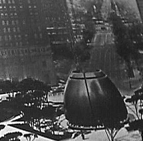
Here we have an enormous egg, cracked open by a very long diagonal(!) axis with a giant jet-stream gushing inside." This project also exhibits a sudden change in design tone (for better or worse, I'm not really sure).
Read "The Bicentennial Commemoration 1976," a rare collaborative text where Scott Brown's name precedes Venturi's. I seriously wonder whether it is actually all Scott Brown.
[note to self: This is starting to remind me of Duboy's Lequeu: An Architectural Enigma meets schizophrenia + architectures, like Learning Contradiction from a Complex Who Done It.]
Perhaps A View from the Campidoglio: Selected Essays 1953-1984 could just as easily be entitled Renewing Vows: still obliged toward the difficult whole.
| |
2013.10.13 16:09
The Sydney Opera House by Jřrn Utzon Celebrates Its 40th Anniversary
quickly shortened as...
Superlatecture
no doubt designed by a superlatect!
I can already see it in the bookstores: a book entitled Superlatecture with an utterly fantastic photo of the Sydney Opera House on the cover. What?!? It's already out of print? Now selling on eBay for $1000s.
2013.11.11 14:19
Why won't you design what we (the public) want?
The columns didn't block the doors. The circulation worked just fine. And I did not "mentioned this work as part of a demonstration of superior knowledge of traditional architecture." The work was mentioned to demonstrate that I was not entirely without some experience in "practicing" traditional architecture.
Miles, reading your posts throughout this forum is like reading a book entitled I don't know if I'll even reach second-fiddle-hood. I especially like the chapter "Oh no, that's way beyond me" You know, the chapter about originality.
2014.01.22 10:26
Architecture encyclopedia?
New working title: Some Titles Become (non-existent) Links.
2014.04.07 09:59
Dissertation Topic
Well Designed Limits =/? Architecture
optional subtitle: So the answer, so the question.
2014.06.13 13:59
The 2014 U.S. Venice Biennale pavilion reinterprets 100 years of American architecture
No doubt Rita Novel would put together an exhibit of American buildings that shouldn't have been built in the first place, entitled Better Never Than Quondam.
2014.07.10 13:46
Art + Architecture: Schumacher vs. Post-Net
2004.08.31:
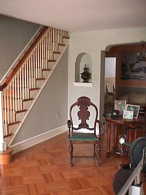
After living there for 48 years and moving out late October 2006, I never thought I'd see the inside of my old house again. Just two days ago I was surprised and quickly saddened by some interior images of my old house online, taken apparently like a year ago:
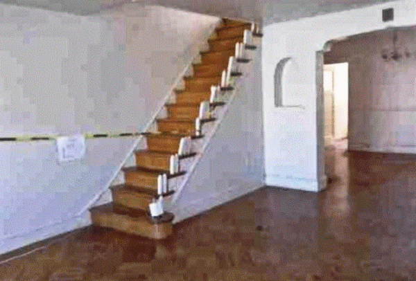
You can consider this post a work of post-internet art entitled Learning from Virtual Museum to Oblivion.
|