2012.08.01 11:03
Narrow Streets Los Angeles
Oh, and speaking of making it cute...
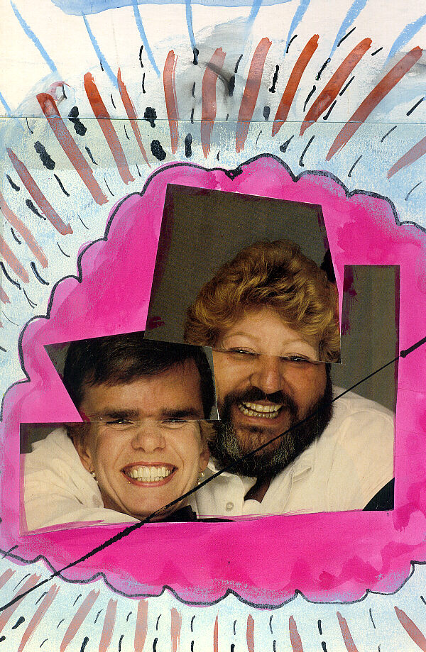
Phantom Opera Buffs 1985.04.11
| |
2012.08.01 10:53
Narrow Streets Los Angeles
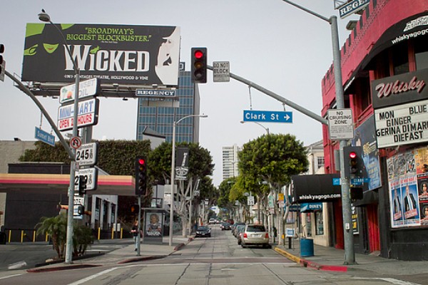
I wouldn't call Yoon's project an exercise in fiction, rather an exercise in virtuality. Unfortunately, "Narrow Streets Los Angeles" follows the all-too-common notion of blurring the real and the virtual. After finally looking at the selection of narrowed streets, I understand what Eric means by "make it all seem cute"--there is indeed a distinct Los Angeles urbanity lost when the streets are no longer the width of almost rivers. The intersection of Cottman and Bustleton Avenues in Northeast Philadelphia actually reminds me a lot of LA (pictured on page 780 of The Harvard Design School Guide to Shopping), and, while surrounded by a plethora of narrow domestic streets, the busy intersection has a quite comfortable large scale fitting to its current nodal function.
Incidentally, Bustleton Avenue has its origin as an 'ancient' Indian trail, while Cottman Avenue started as a straight property line on the 1687 map of Pennsylvania.
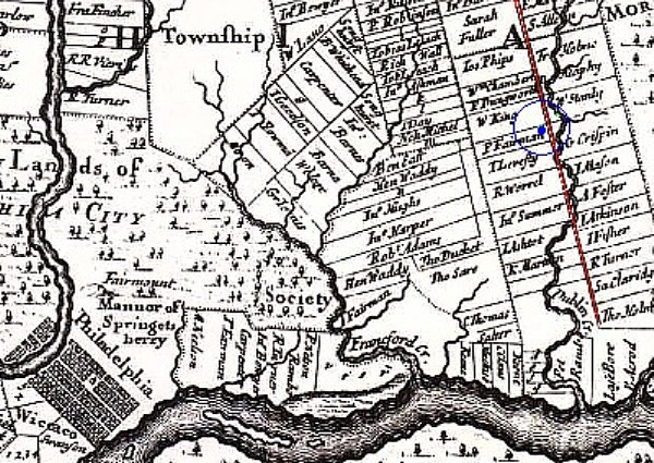
Cottman Avenue is the line parallel and left of the red line above. The blue dot is where I'm sitting right now, and the meander either side of the red line is Pennypack Creek.
Regarding exercises in virtuality, I prefer it when the virtual is held more distinct from the real. For example, taking LA streets and mixing one side of a street with the side of another street, and either playing with the width or not, seems more interesting.
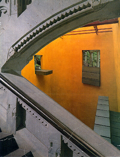
Virtual Domain 002 2001.05.16
| |
2012.07.30 12:22
Is there a good reason for using curves?
A few questions:
How exactly are we so sure that curves mimic nature's process?
What exactly is the good reason for architectural design to mimic nature's (so-called) process via the use of curves?
What exactly makes an architectural design that mimics nature's (so-called) process via the use of curves ethical?
Does the use of curves in architectural design somehow reduce or prevent (all) architecture's (inevitable) entropy?
Or will we find out that the use of curves in architectural design will speed-up said architecture's entropy?
2012.07.30 11:30
selfportraits + architects?
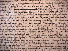
Stephen Lauf, Self Portrait (3 panels: pencil and ink on museum board, 60" x 40" each panel, 1983-84).
I wanted to create something that would manifest endurance and determination, so I lightly scored three large museum boards with pencil lines spaced 3/16" apart which resulted with 317 40" long demarcated spaces running down the length of each board. From here the mission was to simply fill each line of space from edge to edge with hand-written text using a Pelican Graphos pen with nib A.1. I had to lay on the board(s) on the floor of my living room in order to write, and the text records whatever came into my mind at the exact time that I was working/writing on the project. It did not take long for this 'self portrait' to also often act as a confessional.
Self Portrait (1983-84) began 14 August 1983 with approximately 80 lines filled within 6 weeks. The project then lay dormant until 15 July 1984, and the first board was completely filled by 30 July 1984. The second board was completely filled by August 29 1984, and the third board was completely filled by 6 September, 1984.
|