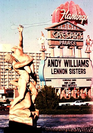
2005.10.14 13:57
From the original Learning from Las Vegas, p. 64:
We shall emphasize image--image over process or form--in asserting that architecture depends in its perception and creation on past experience and emotional association and that these symbolic and representational elements may often be contradictory to the form, structure, and program with which they combine in the same building. We shall survey this contradiction in its two main manifestations:
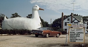
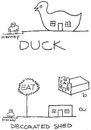
1. Where the architectural systems of space, structure, and program are submerged and distorted by a overall symbolic form. This kind of building-becoming-sculpture we call the duck in honor of the duck-shaped drive-in, "The Long Island Duckling," illustrated in God's Own Junkyard by Peter Blake.
 2. Where systems and structure are directly at the service of program, and ornament is applied independently of them. This we call the decorated shed.
The duck is the special building that is a symbol; the decorated shed is the conventional shelter that applies symbols. We maintain that both kinds of architecture are valid--Chartres is a duck (although it is a decorated shed as well), and the Palazzo Farnese is a decorated shed--but we think that the duck is seldom relevant today, although it pervades Modern architecture.
- - - - -
You rarely hear that "We maintain that both kinds of architecture are valid," and it is certainly open to question as to whether "the duck is seldom relevant today." Prevalence (pervasiveness) harbors relevance by (at least) default, does it not? And note how nowhere in the 'original' terms of the duck and the decorated shed is the notion of "the decorated shed, as counterpoint to the duck, offered a way of achieving a just-as-appropriate response to need/accommodation without dedicating the building to that purpose in perpetuity" espoused. This "not in perpetuity" notion is subsequent interpolation of the duck and the decorated shed polemic and should not be attributed to V,SB&I.
Imagine the work of VSBA in complex contradiction to their own theory? When is Rome, I suppose.
Is the Columbus firehouse really contrary? I see the tower cum sign as double-functioning architecture. Does the sign "integral" to the tower really make the firehouse just a firehouse in perpetuity? You know, they don't make firehouses with towers now--there's not a function for them anymore. But then again, the notion of the decorated shed being a design methodology to accommodate adapted reuse is not what the decorated shed vs. duck argument is originally about.
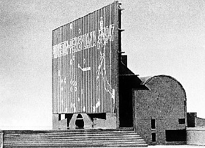 In the Football Hall of Fame, the integral electronic billboard is prefect for adapted reuse, just program the sign with new content.
"Oh dear, what are we going to do about the "carved-in" sign of the Seattle Art Museum if it's ever not a museum. God forbid that people should know that it's the quondam Seattle Art Museum." The decorated shed becomes the duck becomes the decorated duck?!
Is changing history the same as making history? I'd say the work of VSBA made history by their introduction of directions of architecture theory and practice other than the (then) status quo. Changing history is different and occurs in at least two different ways. History is changed when events are recorded and taught as history but are not really reflective of what actually happened, like the 'perversion' that Venturi feels happened to his theory, and inversely, history is changed when a discovery occurs that invalidates established certainties, like the discovery of there actually being two renditions of Piranesi's Ichnographia Campus Martius.
2005.11.16 09:52
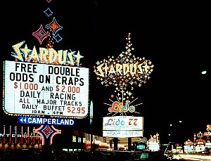
Anyone else watch AMERICAN EXPERIENCE - Las Vegas: An Unconventional History? I was surprised at how much I learned from this 3 hour program. It was like "Learning from the City of Antithesis" -- very "if it's no where else, it's here."
Sin City and Bust! Talk about having your cake and eating it too!
Do you think above-ground nuclear bomb testing will ever be revived for it's tourist attraction fall-out?
Did that veteran showgirl really say that Vegas during the disco era was the best?!? Gosh, you learn something new everyday.
I've never been to Las Vegas, but I've been wanting to go for years now. The odds of my ever getting there, however, are slim.
 2005.11.16 10:32
The first 90 minutes are very worthwhile in that how Las Vegas started and continued to happen (against the odds) is presented clearly and engagingly. I never really knew how Las Vegas was like the exact opposite of all other American cities in that what was illegal everywhere else (including citizens) were, like magic almost, legal in Las Vegas. It's like "who was kidding who?" As if all other American cities were bastions of morality, even.
Las Vegas as capital of Native America?
2007.07.12 11:06
You're misrepresenting when you say Venturi, Scott Brown and Izenour were "excuded from the High Modernist cocktail party" and therefore bitter. Venturi a Rome Prize recipient, Complexity and Contradiction coming out of MoMA, Venturi and Scott Brown teaching at Penn and Yale, Learming from Las Vegas coming out of Yale. I'd say they were definitely guests at the "cocktail" party. The exclusion, you could say, came after Learning from Las Vegas was published (thus no bitterness before the publication, as you imply).
I did begin to re-read Part II of Learning from Las Vegas last night, and I agree with K. in that sarcasm isn't really the modus operandi. It may be too hard now-a-days to recognize the "Pop" sensibility of the critique--the whole mixture of high art and low art which was then something like sacrilege. Plus, the "in your face" stance (i.e., naming names rather than remaining cautiously abstract) was "just not supposed to be done."
For sure there is much taunting and ridicule within "the ugly and the ordinary," as there is always taunting and ridicule whenever an orthodoxy is questioned and critiqued, but the task was accomplished without much sarcasm at all.
You and others may well see sarcasm as an effect of "the ugly and the ordinary" critique, and I concur that that is one fair interpretation, but there is very little sarcasm within the actual text itself.
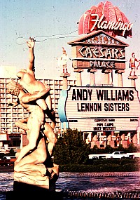
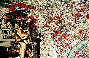 It's probably also fair to say that most people that saw Venturi and Rauch's entry at Roma Interrotta saw sarcasm as well. But was "Pop" sensibility too often just confused for sarcasm? Does "Andy W" suggest more Andy Warhol rather than Andy Williams? Does Lennon suggest more John Lennon than the Lennon Sisters?
 2007.07.12 12:41
sarcasm 1 : a keen or bitter taunt : a cutting gibe or rebuke often delivered in a tone of contempt or disgust
The overall tone of Part II of Learning from Las Vegas is not one of contempt or disgust.
For example:
"Many people like suburia. This is a compelling reason for learning from Levittown. The ultimate irony is that although Modern architecture from the start has claimed a strong social basis for its philosophy, Modern architects have worked to keep formal and social concerns separate rather than together. In dismissing Levittown, Modern architects, who have characteristically promoted the role of the social sciences in architecture, reject whole sets of dominant social patterns because they do not like the architectural consequences of these patterns."
This sounds to me like solid critique rather than contempt or disgust. And the whole texts reads more of solid architectural (because the text really is so rich with just talking about architecture) critique then some sort of sarcastically based evil plot.
| |
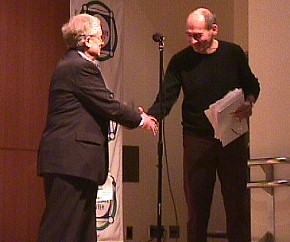
Rem Koolhaas @ In Your Face
CUNY, New York City
September 29, 2001
The provenance of this transcription is somewhat murky. It came to Quondam's collection via an email attachment from a former VSBA associate, who also received it as an email attachment. In any event, Koolhaas' talk was recorded and transcribed, although the text here appears to be only a first attempt draft.
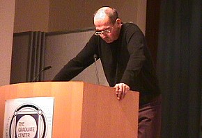
It's always a risk to enter a new territory and be part of an organization and an event over which you have had no control. In the introduction, I hear a kind of certain vindictiveness against Modernism which sounds slightly alarming, and I want to emphasize that no matter what comes, the only reason I'm here is my respect for and liking of the Venturis, and we will see later (kind of) how that can be used or abused in this meeting. I want to tell you a number of vignettes and a number of fragmentary interpretations of the activity of the Venturis, and you have to bear with me if it is not entirely smooth, because it is (kind of) fairly recent, but what I hope to do in this (kind of) short presentation is to introduce a series of themes on the Venturis and a reading of the activity of the Venturis that could be maybe helpful in this discussion.
I want to start by a fluke coincidence: the Concorde, the World Trade Center, and Learning from Las Vegas all appeared more or less at the same time, in 1972. You know what happened to the first two, and we don't know what happened to the third. They were all products of a lavish confidence of cultures striving in a single direction, namely forward. [...] that's (kind of) a very important thing [...], and that is where I think the (kind of) placing of the Venturis in a (kind of) anti-Modemist crusade is entirely wrong. (because) I would say that the birthdate of their book and [what is] perhaps the most ambitious achievement in flight and, in certain way, also the most ambitious achievement in terms of architecture [...] is not a coincidence, and it is very important to look at [Learning from Las Vegas] as a form of modernism.
I remember finding Learning from Las Vegas at the Cornell campus store--a massive slab of a book between white socks and underwear. It is still an impressive use of irony, and, for those who don't know the book in its original form, it was kind of a huge book designed in a kind of quasi-Roman, very monumental style. It is an impressive (use of) irony, that a book about architecture is more a theory of [the] future and even its possible disappearance, to have such a monumental and intimidating presence. And I think that introduced, immediately, the aspect of the Venturis--their (kind of) relentless and savage use of irony.
And then there's a third chapter. It is mysterious and possibly a result of evaporating public patronage that since Learning from Las Vegas, there have been no more architectural manifestoes. All we now talk about are cities. And the fact that we only talk about cities, and that we only work on manifestoes about cities--whether you talk about Banham's Los Angeles, my own New York mutations, or a whole generation of studies of the urban condition--all of that is (most) blatant proof that our speculative abilities have been surpassed by what exists. And I think that, in a way, the Venturis are interesting. [...they and] Learning from Las Vegas is incredibly interesting because it is [simultaneously] a claim to still be able to invent an architectural manifesto, but, in studying an existing situation, it is also a sign that that ability will soon be over, and perhaps the book itself exhausts that ability for the last time.
[Post] Learning from Las Vegas we had Banham's Los Angeles, Delirious New York, and all these books are connected [...] by their own, for our own, lack of mastery. Somehow it became fashionable after Learning from Las Vegas, (and I think this was certainly not the intentions of Venturi and Scott Brown that it became fashionable), to pride ourselves of our lack of claim to be able to be part of a solution, and that we were gloating [...] increasingly baroque descriptions of inability. But you also have to ask what influence Learning from Las Vegas was on that phenomenon. [...] what the Venturis did then for the first time in an architectural manifesto [was to tell] architects to direct their gaze and the way they were looking outward rather than inward. [...] what is fascinating about Learning from Las Vegas, if you look at it now, is that they were the first architects who did not say how to do anything. [...] Las Vegas was an embodied situation that they decoded to some extent, but they always refrained from (kind of) reading it as a prescriptive condition. [...] I think that certainly Scott Brown's more sociological interest was a kind of driving force in shifting this look of architecture away from architecture, with consequences that cannot be easily understood and that are probably underestimated, to the extent that perhaps the book is the beginning of a crisis of confidence in architecture.
Apart from turning our look outward, the great detonation charge of Learning from Las Vegas was finally the introduction of two sketches--the Duck and the Decorated Shed--that seemingly once and for all reduced all architectural choice to two terminal archetypes, a dilemma that, however disguised its humor and dressed in a rhetoric of populism, was actually pretty malicious[?] and apocalyptic. After Mies's "God is in the details," maybe the discussion of the Shed and the Duck was architecture's equivalent of "God is dead." And I think this is an important statement because (I think) very few people have really understood the darkness of some of the contents of this architectural firm and their kind of thinking.
"...the building becomes a diagram of an oversimplified program for living--an abstract theory of either-or. Where simplicity cannot work, simpleness results. Blatant simplification means bland architecture. Less is a bore.
Robert Venturi, Complexity and Contradiction in Architecture (1966), p. 25.
It is their aphorisms more than their forms that have put them in a sequence of precedence in architectures that goes from Vitruvius' "commodity, [firmness] and delight," to Mies's "less is more," to end with a lethal "less is a bore." And I want to again emphasize the darkness of this work because with "less is a bore" became the alibi [... for] the Philistine. It provided the alibi for an American imperialism of history and context from which even (the) thoughtless generic Modernism is a relief, and from which even beyond the obvious, such as Graves, the entire spectrum, from Skidmore to Jerdy to Gehry, is the unintended beneficiary. [...] This is also a statement that is important to address: "less is a bore," no matter how ironic and possibly well-meaning and possibly good the intentions of Bob Venturi when he said this--realize he never said it [sic], just as Mies is rumored to never have said "less is more"-- [...]behind the Guggenheim in Bilbao is "less is a bore" just as it is behind Skidmore's project for Columbus Circle and presumably for whatever takes place at the World Trade Center.
Fortunately, there are no architectural tribunals, (yet, but it might be imminent), but it would be a tough assignment to settle whose crimes were bigger: Mies for launching the apotheosis of the Duck, or the Venturis (and I apologize to Denise for saying "Venturis" but it is at this point perhaps excusable and in any event intended clearly to incorporate both of you) for the [?] of the Duck. I actually may have been an unintended witness of the moment when the Venturis' message was taken away from them and taken over by others, where this amazing kind of a divorce between the aphorisms and the kind of written work and the actual architectural work became evident. It was somewhere in the mid-'80s when a number of European and American architectural firms had been summoned to a hotel in Paris to show the Chairman of Disney their projects for hotels in Disney and in EuroDisney. In this moment of inexplicable enlightenment, Disney had chosen a group of European and a group of American architects to work on these hotels, but they had not told each of these groups that they were working, frequently, in competition, so that the cream of the cream of the architectural world came carrying models, and very often found the kind of footprint of the models (kind of) taken by their colleagues.
At that moment (it was an audience that apart from Bob Venturi also included Graves and Stern--Graves at that point already an architect for Disney, and Stem even on the board of Disney) it became clear that a process had taken place that separated the initiator from any possible implementation of his dream, and also it showed the incredible integrity of the initiator. Here were these architects, [...] Stern and Graves, who are two examples of the kind of Disney monumentalism that is still carried forward. And here was Bob Venturi with an incredibly awkward and unspeakably ugly, but, according to the theory, literally correct model, which looked like a New York welfare hotel, and which had a kind of desultory decoration on the top that was either kind of a sunburst or maybe a rainbow.
And it was really clear that that kind of architecture, no matter that Venturi had been the initiator of that movement, representing it in the heart of capitalism at the kind of emerging moment when the market economy was becoming triumphant, that there was simply no hope in hell that it could be realized, and that basically the entire package and the entire thinking was taken away from him, and, ironically, I think that was also the moment that he became more aware that perhaps he was more of a Modernist than even he believed and certainly than his fans believed.
What Venturi and Scott Brown could not anticipate is how Reaganomics and the market economy it launched have influenced their meaning. What is most striking about Leaming from Las Vegas is its relative innocence, but also its position at the beginning of an incredible escalation, the importance of the economy, an incredible withering of the public and an incredible flourishing of the private. [...] Somehow, Reagan and Co. killed the generic. The market has no tolerance for ugly buildings. [...] We all do Ducks now--that is the second bond between schlock and avant garde. The market economy has worked havoc with the Venturis' semantics, and, at the same time, can you blame anyone for influence? And I think that's a kind of very compelling and urgent question, very compelling for anyone who is supposedly successful in architecture currently in the incredible exposure of media culture, the sense of how any idea is debased before it is launched.
It is a cool irony how the amalgamation of a sympathy for America's commercial vernacular, prepared by a hardcore socialist's appreciation of London's East End working class culture, and before that in opening to the truly African, combined with a sometimes pristine probing of the intricacies of European historical precedent, with its push and pull of imposition and deflection, [could result in] a true social, aesthetic, anthropological witch's brew that could no longer be controlled by anyone in the kind of storms of the economy.
Nevertheless I think because of all this phenomena, the current status of the office is enviable. The dialectics of this couple, with the earnestness and stubbornness of the one continues in the frivolity of the other in a kind of reciprocal shielding that has enabled them to engineer a rare mixture of huge influence and relative unpopularity, which, needless to say, today almost corresponds to virtue. I think that it's actually a deeply serious achievement, in this day and age, to find a combination of influence and difficulty that the Venturis have established, and that is perhaps one of the kind of areas by which I am most influenced, and which I think is most exciting.
Maybe the most critical dimension today of their work is the apparent openness of the work that can be so much more moving than the kind of architecture of their contemporaries.
| |
2007.07.12 12:49
Sarcastic Architecture
...yes, 'iconography and electronics' is an entirely different set of texts (like almost 30 years after Learning from Las Vegas), and the bitterness therein may well stem from the aftermath of Learning from Las Vegas.
2007.07.13 08:40
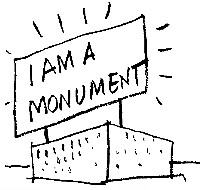
Found what may be the most sarcastic (but also the most critical) passage within the "ugly and ordinary" texts of Learning from Las Vegas:
"The Boston City Hall and its urban complex are the archetype of enlightened urban renewal. The profusion of symbolic forms, which recall the extravagances of the General Grant period, and the revival of the medieval piazza and its palazzo pubblico are in the end a bore. It is too architectural. A conventional loft would accomodate a bureaucracy better, perhaps with a blinking sign on top saying I AM A MONUMENT."
 2007.07.13 12:29
What I've found within the "ugly and ordinary" texts thus far are instances of the literary use of slight sarcasm usually at the end of a paragraph that culminates the point of a particular argument--like adding a bit of 'zing' at the end, a little akin to a punch-line. Like I already said, the overall tone of the "ugly and ordinary" texts is not sarcastic.
As to the negativity of the text, yes it is there, but that is only to be expected in a polemic aimed at an orthodoxy.
While reading "ugly and ordinary" last night I too thought of 'cynicism'. I also thought I should next re-read Koolhaas's Junkspace.
One of things I'm getting out of all this is that solid criticism does (have to?) employ literary elements like cynicism, wit, satire and even some sarcasm. Sure, it comes off as negative, but it's really more metabolic, destructive and creative at the same time.
2007.07.31 11:36
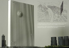
Learning from Las Vegas + SMLXL = Dubai
 flip up flip up
 flip down
2008.05.15 08:17
For the record:
"The duck is the special building that is a symbol; the decorated shed is the conventional shelter that applies symbols. We maintain that both types of architecture are valid--Chartres is a duck (although it is a decorated shed as well), and the Palazzo Farnese is a decorated shed--but we think that the duck is seldom relevant today, although it pervades Modern architecture." --Learning from Las Vegas, four years after 1968.
Perhaps the case today is that the duck has become (via media) more relevant (to society), and the decorated shed has become more (true to form) ephemeral. I maintain that both these types of architecture are valid. flip down
2008.05.15 08:17
For the record:
"The duck is the special building that is a symbol; the decorated shed is the conventional shelter that applies symbols. We maintain that both types of architecture are valid--Chartres is a duck (although it is a decorated shed as well), and the Palazzo Farnese is a decorated shed--but we think that the duck is seldom relevant today, although it pervades Modern architecture." --Learning from Las Vegas, four years after 1968.
Perhaps the case today is that the duck has become (via media) more relevant (to society), and the decorated shed has become more (true to form) ephemeral. I maintain that both these types of architecture are valid.
2009.12.16 10:16
Ugly Architecture (purposefully so)
Part II of Learning from Las Vegas is entitled "Ugly and Ordinary Architecture, or the Decorated Shed" with a specific essay therein entitled "Heroic and Original, or Ugly and Ordinary".
Regarding the architecture of FAT, the Gooding House* may be a major precedent.
*designed 1977, same year as the publication of The Language of Post-Modern Architecture where the image at the bottom of page 115 offers an interesting coincidence.
2013.08.04 16:55
Learning from Learning from Las Vegas (again)
it's just that the first and revised edition of Learning from Las Vegas are virtually two different books, that's all. Yes, the texts are the same, so both are valid 'readings'. The revised edition is interesting in that it is a redesign by Denise Scott Brown. You can read about the two editions in...
Aron Vinegar, I AM A MONUMENT: On Learning from Las Vegas (2008).
"Learning from Las Vegas, originally published by the MIT Press in 1972, was one of the most influential and controversial architectural books of its era. Forty years later, it remains a perennial bestseller and a definitive theoretical text. Its authors--architects Robert Venturi, Denise Scott Brown, and Steven Izenour--famously used the Las Vegas Strip to argue the virtues of the "ordinary and ugly" above the "heroic and original" qualities of architectural modernism. Learning from Las Vegas not only moved architecture to the center of cultural debates, it changed our ideas about what architecture was and could be. In this provocative rereading of an iconic text, Aron Vinegar argues that to read Learning from Las Vegas only as an exemplary postmodernist text--to understand it, for example, as a call for pastiche or as ironic provocation--is to underestimate its deeper critical and ethical meaning, and to miss the underlying dialectic between skepticism and the ordinary, expression and the deadpan, that runs through the text. Especially revealing is Vinegar's close analysis of the differences between the first 1972 edition, designed for the MIT Press by Muriel Cooper, and the "revised" edition of 1977, which was radically stripped down and largely redesigned by Denise Scott Brown."

classic camp interlude
I read I am a Monument a few years ago, and I remember Scott Brown coming off as an over-control freak. Also, the work exhibited in the first edition was from Venturi and Rauch Architects.
This makes me wonder whether the texts of Learning from Las Vegas are by Scott Brown much more than the two other authors. In looking through both editions recently, it became somewhat easy to pick out the paragraphs written by Venturi--they're usually toward the end of a 'chapter' and deal generally with historical precedents. It might be interesting to sift out the texts that are most obviously Scott Brown versus Venturi. What exactly was Izenour's role in all this?
tammuz x, can you point out some of the 'deep flaws' you find throughout the texts? I'd be very interested in discussing that aspect, because, for all the books notoriety, a lot of the book's 'theories' did not seem to work out as intended.
I was using hyperbole when I said, "I fell in love with the book as soon as I saw the cover." It wasn't Tanya herself but rather the 8th grade memory that her image evoked that attracted the book to me.

And my personally memory, which no one else would normally know about, may well be an indication of just how fluid/transient symbolism actually is. And it might well be the transience of symbolism that Learning from Las Vegas completely missed recognition of.
I just composed four pages on Learning from Las Vegas at Quondam. Among the texts is a review of LfLV from Life magazine a month before LfLV was published. It's an interesting perspective that seems to have paved the way for most of the subsequent interpretations.
One of the last things I wrote in relation to Learning from Las Vegas is from 2008:
"The duck is the special building that is a symbol; the decorated shed is the conventional shelter that applies symbols. We maintain that both types of architecture are valid--Chartres is a duck (although it is a decorated shed as well), and the Palazzo Farnese is a decorated shed--but we think that the duck is seldom relevant today, although it pervades Modern architecture." --Learning from Las Vegas, four years after 1968.
Perhaps the case today is that the duck has become (via media) more relevant (to society), and the decorated shed has become more (true to form) ephemeral. I maintain that both these types of architecture are valid.
Two of the Venturi and Rauch buildings that are most closely related to the 'theories' of Learning from Las Vegas simply no longer exist.


1998.09.17 10:55
fact check and some truth
On Tuesday, I spoke (on the phone) with Susan S., the PR rep of Venturi Scott Brown & Assoc. She did not know that the big BASCO sign was now gone, and she pretty much assumed Mr. Venturi did not know either. Although this was our first time speaking together, we had a very animated conversation about "commercial" architecture and its fate as something fleeting. Recognition of this phenomenon may be especially easy for baby boomers to see because so many places of memories from the 1950s and 1960s are simply no longer there.
I specifically called to find out if the big BASCO sign's second design--where the red letters were painted yellow and then covered with an overall pattern spelling the word BEST--upon the meager of Basco and Best was also a Venturi office design. It was.
Last night, I re-read what Venturi, Scott Brown and Izenour said about Las Vegas signs in Learning from Las Vegas, and it is as if they unwittingly predicted the fate of their own big sign.
2013.08.06 09:17
Learning from Learning from Las Vegas (again)
... you raise valid points regarding 'symbolism' (or lack there of) within LfLV. There is likewise talk of 'communication' and 'meaning', and these along with symbolism seem to be treated as the same thing. This too may be part of the flaw.
I'm in the midst of preparing a larger response--what motivated Learning from Las Vegas in the first place...
|
 2. Where systems and structure are directly at the service of program, and ornament is applied independently of them. This we call the decorated shed.
The duck is the special building that is a symbol; the decorated shed is the conventional shelter that applies symbols. We maintain that both kinds of architecture are valid--Chartres is a duck (although it is a decorated shed as well), and the Palazzo Farnese is a decorated shed--but we think that the duck is seldom relevant today, although it pervades Modern architecture.
- - - - -
You rarely hear that "We maintain that both kinds of architecture are valid," and it is certainly open to question as to whether "the duck is seldom relevant today." Prevalence (pervasiveness) harbors relevance by (at least) default, does it not? And note how nowhere in the 'original' terms of the duck and the decorated shed is the notion of "the decorated shed, as counterpoint to the duck, offered a way of achieving a just-as-appropriate response to need/accommodation without dedicating the building to that purpose in perpetuity" espoused. This "not in perpetuity" notion is subsequent interpolation of the duck and the decorated shed polemic and should not be attributed to V,SB&I.
Imagine the work of VSBA in complex contradiction to their own theory? When is Rome, I suppose.
Is the Columbus firehouse really contrary? I see the tower cum sign as double-functioning architecture. Does the sign "integral" to the tower really make the firehouse just a firehouse in perpetuity? You know, they don't make firehouses with towers now--there's not a function for them anymore. But then again, the notion of the decorated shed being a design methodology to accommodate adapted reuse is not what the decorated shed vs. duck argument is originally about.
 In the Football Hall of Fame, the integral electronic billboard is prefect for adapted reuse, just program the sign with new content.
"Oh dear, what are we going to do about the "carved-in" sign of the Seattle Art Museum if it's ever not a museum. God forbid that people should know that it's the quondam Seattle Art Museum." The decorated shed becomes the duck becomes the decorated duck?!
Is changing history the same as making history? I'd say the work of VSBA made history by their introduction of directions of architecture theory and practice other than the (then) status quo. Changing history is different and occurs in at least two different ways. History is changed when events are recorded and taught as history but are not really reflective of what actually happened, like the 'perversion' that Venturi feels happened to his theory, and inversely, history is changed when a discovery occurs that invalidates established certainties, like the discovery of there actually being two renditions of Piranesi's Ichnographia Campus Martius.
2005.
 2005.
2005. It's probably also fair to say that most people that saw Venturi and Rauch's entry at Roma Interrotta saw sarcasm as well. But was "Pop" sensibility too often just confused for sarcasm? Does "Andy W" suggest more Andy Warhol rather than Andy Williams? Does Lennon suggest more John Lennon than the Lennon Sisters?
 2007.
2007.


 2007.
2007. flip up
  flip down
