1998.03.21
Viva Villa d'Este
...the hydraulic connection between Las Vegas and the Villa d'Este --"... Viva Villa d'Este." ...the following is a list of the salient points:
a. the hydraulic power behind the lighting of Las Vegas has never been mentioned by the "Learning from Las Vegas" camp.
b. Hoover Dam is analogous to Roman aqueducts.
c. it is interesting to note that R. Venturi has now turned his attention to "electronic" architecture whereby the "box" of the building is decorated with ever-moving murals composed of hundreds and thousands of tiny programmed lights.
d. Las Vegas's giant electronic signs and facades are analogous to the vast array of fountain types on display throughout the water garden of the Villa d'Este.
f. the notion that Las Vegas is now more becoming an "oasis" and its architecture now reflects that motif.
1998.09.17 10:55
fact check and some truth
I specifically called to find out if the big BASCO sign's second design--where the red letters were painted yellow and then covered with an overall pattern spelling the word BEST--upon the meager of Basco and Best was also a Venturi office design. It was.
Last night, I re-read what Venturi, Scott Brown and Izenour said about Las Vegas signs in Learning from Las Vegas, and it is as if they unwittingly predicted the fate of their own big sign.
1999.08.10 10:58
ae fragments/vitruvius
The importance/power of water remains vital with regard to electricity and urban design, specifically the power of hydro-electricity, and thus there is one more thing to "learn from Las Vegas" vis-ŕ-vis Hoover Dam. The history of both Las Vegas and Hoover Dam are inseparable, albeit, Las Vegas is there because of Hoover Dam--a new and electric (powered) oasis in the Nevada desert.
Like the multitudinous fountains of the Villa d'Este garden near Rome--a Cardinal's Renaissance retreat brought to life subsequent to the reinstatement of a long destroyed ancient Roman aqueduct--the multitudinous flashing (splashing) signs of the Las Vegas strip and the old part of town are indeed water fountains reenacted as spent electricity (water power energy!).
Las Vegas is nothing less than an enormous hyrdo-electric reenactment of an oasis (complete with caravans, watering holes, and even a pyramid), and thus it is not at all unusual that the whole notion of reenactment is now Las Vegas' predominant theme.
1999.08.26 09:53
Re: empire of light
...scale, which today often goes unrecognized and/or accessed (however, Koolhaas via SMLXL has certainly brought the scale issue to contemporary attention, and, of course, Venturi et al have paid close attention to the often overlooked obviousness of comparative architecture scale earlier). We are more used to thinking of scale in terms of physical magnitude/size, and indeed comparative analysis of such scale in architecture (e.g. seeing varieties of building plans at the same scale) is most times revealing of a architectural "dimension" not normally taken notice of. Scale can be a good theme to follow when comparing architecture...
2001.01.13
the 'mediocre'
Rick wrote:
Contrarily, Stephen Lauf's rather ironic localization of the whole issue into a mediocre ball of wax speaks more to reality than I care to admit. To me he reminds, tongue in cheek, the way it is. And I assume the implication is that all too often this is where the matter stands, and thus where it may as well be deified -- to use Venturi's phrase, to take the ugly and the ordinary over the heroic and the original.
Steve replies (and hopefully clarifies his position):
One, I'm glad to see an admission by an architect that signifies the existence of the notion that there is indeed a realm of reality within the built environment that architect's would rather (most often) not recognize.
Second, I want to make clear that the 'mediocre' is not in my view the same and "the ugly and the ordinary". I still equate 'bad' architecture with "the ugly and the ordinary," and likewise equate 'good' architecture with "the heroic and the original." Furthermore, the equation of "the ugly and the ordinary" with "the heroic and the original," as Rick noted, has already been theorized and practiced by Venturi and his various partnerships. Hence, the 'mediocre' is neither bad or good, rather a realm all its own, and, moreover, a realm exceedingly larger than the realm of the bad or the good.
My thinking regarding the mediocre actually stems from the Scripturally reported words of Christ where He states (and here I paraphrase) that the bad and the good are swallowable, whereas the luke warm is "vomited out of My mouth." Like most aspects of Christ, there is a base extremism here, and likewise there is a seeming contraction of 'correctness'. I remain intrigued as to what this actually might mean, and so far conclude that the mediocre is the worst of all [at least in terms of entrance into the Heavenly Kingdom].
Granted it may appear strange to mix religion/theology with architectural aesthetics, yet I remain mindful that the discussion here is about the "bad" and the "good" -- so the connection is not so foreign after all.
Art and religion have an enormous history together, but art and the secular do not share such a vast history. I'll pose a question: is the 'mediocre' the true art of the secular? I know I don't have an answer to that, nor do I even know if the question is fair. Yet, when I think of the secular, I also think of the users of architecture. I'm sure we all know many mediocre buildings that actually work remarkably well in terms of the people using the buildings. Hospitals, for example, are extreme user-based designed buildings, and they pretty much have to work well (otherwise they run the risk of being truly fatal!). Another example is the local town hall or meeting place, that often non-descript space where communities generate intensification.
You know what, as I sit here writing, I think I just realized what Christ's parable means: The good and the bad are already taken care of, their course is pretty much a matter of fact, their destiny is clear. The mediocre, however, needs work! [For starters, let's being seeing handicapped assess as art, and even the fire exit as the potential life saver that it actually is.]
2001.03.01
ideas
1. Costa Iberica is a reenactment of Learning from Las Vegas. CI goes so far as to suggest a design that reenacts LV itself, plus a design that reenacts Villa Radiuse. I could use many digital shots of Atlantic City and Wildwood (and other Jersey shore towns?) to illustrate my ideas.
2. It's funny how the Yale architecture studio from which LfLV is derived was actually in Las Vegas in 1968--the year that is so popular now in architectural theory.
3. There is an interesting illustration of how Le Corbusier's La Tourette was "reenacted" by subsequent architectural designs by architects obviously inspired by the Le Corbusier building. This makes me feel like there is perhaps a little more on "reenactment" within the theories of Venturi and Scott Brown. Don't forget the line about "copying with wit" (or something like that).
2001.08.08 14:04
LfLV arrived
...compiling another example of reenactment. If you're familiar with MVRDV's book Costa Iberica: Upbeat To The Leisure City (2000) you will see that they (MVRDV- Dutch architects and quondam Koolhaas employees) pretty much reenact Learning from Las Vegas.
2001.09.10 09:34
Re: travels in hyper-reality
Theming aside, at base there is the 'practice' of reenactment carried out at both Odiaba and Las Vegas. The final point about Odiaba being all on an artificial island is literally the base of Odiaba that is itself a reenactment of something otherwise natural. Las Vegas too has a basis that is a man-made reenactment of something otherwise natural, namely the 'oasis' spawned by Hoover Dam. While Learning From Las Vegas indeed recognizes the 'oasis' aspect within the 1960s hotel complexes, it does not recognize the overall oasis reenactment of Las Vegas as a whole. Along with all the 'caravans' that converge upon Las Vegas seeking 'pleasure' and 'comfort' in the desert, it is more the hydroelectric well spring of Las Vegas (via Hoover Dam) that engenders the entire cities life-givingness. In this sense, the animated electric signs along the strip (and now also within Fremont Street's electronic vault) are all at base hydroelectric reenactments of fountains splashing away.
My favorite reenactment place/city lately is Atlantic City, New Jersey, a true latter-day Las Vegas on the sea-coast, essentially a reenactment of a reenactment of a reenactment all right on the edge of a continent.
All the same, I believe it is safe to say that Las Vegas is the reenactment capital of modern times. It wouldn't surprise me in the least if one of the next waves of new casino construction comes to reenact Las Vegas of the 1960s, or, if I were ever the 'planning commissioner' of Las Vegas, I'd begin efforts to construct colossal wave pools all around Las Vegas so as to reenact Atlantic City. Reenactment is hyper-reality for sure.
2005.10.12 12:12
Jimmy Venturi's new website...
...the whole notion of "being allowed" is what makes me think "how pedantic." Who do you think "allowed" the post-World War II Italian architects "to look to the past for guidance and inspiration" and hence whose built designs influenced the young, pre-C&C Venturi? Likewise, who "allowed" the architects of Las Vegas that V,SB&I learned from?
2007.07.11 20:24
Sarcastic Architecture
In light of "a cutting, often ironic remark intended to wound," Part II: Ugly and Ordinary Architecture, or the Decorated Shed in Learning from Las Vegas may indeed be well spiced with sarcasm. Personally, I haven't read the text in quite some time, but in just scanning it now, there is a fair bit of "cutting" critique. Should make for an interesting re-read this time around.
2007.08.20 22:33
thesis... phenomenology
Did Le Corbusier and Venturi "act as if their building is a proof of their ideas?"
I'd say they practiced their theories, but they didn't necessarily set out to prove their theories. Also, Le Corbusier and Venturi mostly presented their theories together with a presentation of their built and unbuilt work.
2008.03.05 12:22
Archinect's The Plagiarius Awards Gallery
here a quack, there a quack
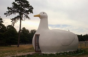
everywhere a reenactionary quack quack
Will the metaphor ever be shed?
2013.07.15 13:34
Why is everyone bashing OMA and Rem Koolhaas?
March 1968 "A Significance for A&P Parking Lots, or Learning from Las Vegas" published in Architecture Forum magazine.
Fall 1968 "Learning from Las Vegas, or Form Analysis as Design Research" studio at Yale; 10 day spent in Las Vegas.
10 January 1969 LLV exhibit at Yale.
1972 Learning from Las Vegas published by MIT Press; Part III (in the first edition only) featured Venturi and Rauch projects from 1965-1971.
...you can read the rest of Koolhaas 2001 text here. I posted the quotation here as an example of an "out of the ordinary" Koolhaas text. Koolhaas and Orbist interviewed Venturi and Scott Brown in 2000 (at Geneva) and this interview along with the 2001 Koolhaas text probably provide a fuller picture of Koolhaas's thinking in this case. Also, Koolhaas with Venturi at the Vanna Venturi House.
It's been a long time since I looked through Harvard Design School Guide to Shopping.
2014.07.07 13:54
7 July
Herzog & de Meuron in Mexico right on the U.S.A. border:
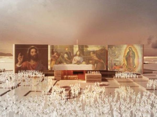
2004.05.19:
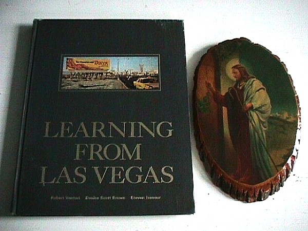
| |
2013.07.29 16:47
Learning from Learning from Las Vegas (again)
...are you at all familiar with the first edition? What's missing from the second edition is Part III, Essays in the Ugly and Ordinary: Some Decorated Sheds which is a exposition of Venturi & Rauch projects from 1966-1971--in some relevant ways these projects complement the texts. The first edition is also much more a book where you can 'read' the pictures without reading much of the text (which is how I mostly 'read' the book as a student back in the last half of the 1970s.
Regarding hyperbole and the 1968-72 Zeitgeist here in the US. I was in 8th grade 1969-70 at St. Ambrose School at C St. and Roosevelt Boulevard, Philadelphia. Our teacher was Sister Charles Mary, a squat, very over-weight nun (her nickname among the students was Fat Chuck). Our classroom had large wall-to-wall windows facing Roosevelt Boulevard, a 12 lane green urban thoroughfare, and the R bus and the J bus had a stop right at our corner. Sister Chuck divided our class (of about 60) into girls on one side and boys on the other (window) side. In the spring of 1970, one rather suddenly saw Tan Hawaiian with Tanya advertisements on the sides of busses all over Philadelphia (the same as the billboard on the cover of Learning from Las Vegas). This ubiquous bikini clad female body prompted Sister Chuck to lecture us one day on morality (or whatever), saying how such a public advertisement was shameful (or something like that). I sat in the row right next to the windows, and just after Sister Chuck gave her lecture, I looked out the window waiting for a bus to drive by, and it didn't take long before I simply said, "There it is." Well, the whole boy's half of the classroom went absolutely nuts, literally jumping out of their seats yelling and whistling, with those nearest the windows lunging their arms out the windows yelling "I want you! I want you!" Of course, now Fat Chuck also went berzerk screaming, "Sit down! Sit down! Sit down!" and it only quieted down when Fat Chuck looked like she was actually about to have a heart attack.
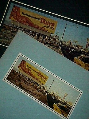
When I first saw Learning from Las Vegas circa 1975-76, I fell in love with the book as soon as I saw the cover. Can you really blame me?
| |
1998.03.21
...the hydraulic connection between Las Vegas and the Villa d'Este
Viva Villa d'Este
The hydraulic power behind the lighting of Las Vegas has never been mentioned by the Learning from Las Vegas camp.
Hoover Dam is somewhat analogous to Roman aqueducts.
It is interesting to note that Robert Venturi has now turned his attention to "electronic" architecture whereby the "box" of the building is decorated with ever-moving murals composed of hundreds and thousands of tiny programmed lights.
Las Vegas's giant electronic signs and facades are analogous to the vast array of fountain types on display throughout the water garden of the Villa d'Este.
1998.10.30
from: artificial oasis, to: thriving artificial oasis, re: missed lesson from Las Vegas
Besides the notion of hydraulics and electric fountains, there is a whole new theme of "artificiality", and how Venturi et al never fully acknowledged the artificiality of everyday America, and now that Las Vegas has fully embraced its own artificiality, Venturi et al see the new Las Vegas as counter to their original thesis.
2000.12.01
Philadelphia is a Roman colonial camp reenactment (and you might even put camp in quotes, a la Learning from Las Vegas via Philadelphians).
2001.01.13
I want to make clear that the 'mediocre' is not in my view the same and "the ugly and the ordinary". I still equate 'bad' architecture with "the ugly and the ordinary," and likewise equate 'good' architecture with "the heroic and the original." Furthermore, the equation of "the ugly and the ordinary" with "the heroic and the original," as already noted, has already been theorized and practiced by Venturi and his various partnerships. Hence, the 'mediocre' is neither bad or good, rather a realm all its own, and, moreover, a realm exceedingly larger than the realm of the bad or the good.
My thinking regarding the mediocre actually stems from the Scripturally reported words of Christ where He states (and here I paraphrase) that the bad and the good are swallowable, whereas the lukewarm is "vomited out of My mouth." Like most aspects of Christ, there is a base extremism here, and likewise there is a seeming contraction of 'correctness'. I remain intrigued as to what this actually might mean, and so far conclude that the mediocre is the worst of all (at least in terms of entrance into the Heavenly Kingdom).
Granted it may appear strange to mix religion/theology with architectural aesthetics, yet I remain mindful that the discussion here is about the "bad" and the "good" -- so the connection is not so foreign after all. 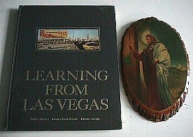 Art and religion have an enormous history together, but art and the secular do not share such a vast history. I'll pose a question: is the 'mediocre' the true art of the secular? I know I don't have an answer to that, nor do I even know if the question is fair. Yet, when I think of the secular, I also think of the users of architecture. I'm sure we all know many mediocre buildings that actually work remarkably well in terms of the people using the buildings. Hospitals, for example, are extreme user-based designed buildings, and they pretty much have to work well (otherwise they run the risk of being truly fatal). Another example is the local town hall or meeting place, that often nondescript space where communities generate intensification.
You know what, as I sit here writing, I think I just realized what Christ's parable means: The good and the bad are already taken care of, their course is pretty much a matter of fact, their destiny is clear. The mediocre, however, needs work!
2001.03.01
ideas
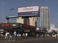
1. Costa Iberica is a reenactment of Learning from Las Vegas. Costa Iberica goes so far as to suggest a design that reenacts Las Vegas itself, plus a design that reenacts Villa Radiuse. I could use many digital shots of Atlantic City and Wildwood (and other Jersey shore towns?) to illustrate a reenactment of the reenactment.
 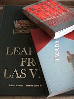  2. It's funny how the Yale architecture studio from which Learning from Las Vegas is derived was actually in Las Vegas in 1968--the year that is so popular now in architectural theory.
3. There is an interesting illustration of how Le Corbusier's La Tourette was "reenacted" by subsequent architectural designs by architects obviously inspired by the Le Corbusier building. This makes me feel like there is perhaps a little more on "reenactment" within the theories of Venturi and Scott Brown. Don't forget the line about "copying with wit" (or something like that).
  2001.05.26
...reading Architecture and Civilization (Elementa vol. 74, 1999). It is a collection of essays edited by Michael H. Mitias... So far I've read the Introduction and most of the first essay, "Architecture, Art, and Works of Art" by T.J. Diffey. Here's a paragraph from Diffey's text (pp. 12-13) that really struck me:
"Buildings, then are for use: the spectatorial stance of much contemporary aesthetics in the Kantian tradition, in spite of notable protests against it, for example in writings by Arnold Berleant, in so far as this stance prevails, sits ill with the fact that the main point about a building is to use it. This spectatorial stance makes architecture a problem case for aesthetics. It would be better to have things the other way round, that is, to have architecture as presenting problems which aesthetics could solve and not as an art which runs against the grain of current aesthetics. Would that we might learn something about architecture and deepen our understanding of it from the insights of aesthetics rather than have to shift to get architecture to fit the current preconceptions of aesthetics. For it is striking how ill architecture fits these. For example, architecture stirs the passions, for it is intimately bound up with questions of national glory and personal identity. I suffer when a building which has played a part in my life is demolished, e.g., the church where I was married. Against this it has to be said that buildings of personal importance in our lives are often of no architectural importance. Although this distinction is often drawn between personal associations with an object or work and its artistic or aesthetic significance, and I draw it myself, what is less often considered are what the cultural implications of this dislocation are if it is a common feature of our experience. What are we to think of a culture in which we are personally attached to artistically worthless objects and conversely not personally attached to many works of art? What does this tell us about the concepts of art and works of art which are operating in this culture, if this polarity between art and everyday experience is commonplace?"
[Have] Venturi, Scott Brown and Izenour been championing an aesthetic architecture of the everyday for over three decades now [in a similar vein?]
|


 Art and religion have an enormous history together, but art and the secular do not share such a vast history. I'll pose a question: is the 'mediocre' the true art of the secular? I know I don't have an answer to that, nor do I even know if the question is fair. Yet, when I think of the secular, I also think of the users of architecture. I'm sure we all know many mediocre buildings that actually work remarkably well in terms of the people using the buildings. Hospitals, for example, are extreme user-based designed buildings, and they pretty much have to work well (otherwise they run the risk of being truly fatal). Another example is the local town hall or meeting place, that often nondescript space where communities generate intensification.
You know what, as I sit here writing, I think I just realized what Christ's parable means: The good and the bad are already taken care of, their course is pretty much a matter of fact, their destiny is clear. The mediocre, however, needs work!
2001.
 2. It's funny how the Yale architecture studio from which Learning from Las Vegas is derived was actually in Las Vegas in 1968--the year that is so popular now in architectural theory.
3. There is an interesting illustration of how Le Corbusier's La Tourette was "reenacted" by subsequent architectural designs by architects obviously inspired by the Le Corbusier building. This makes me feel like there is perhaps a little more on "reenactment" within the theories of Venturi and Scott Brown. Don't forget the line about "copying with wit" (or something like that).
  2001.
2001.